Wednesday 30 December 2015

OUGD404 - Study task 05 - Figure/ Ground

The eye differentiates objects from the surrounding area. A form, silhouette, or shape is naturally perceived as figure (object) whilst the surrounding area is seen as ground. Balancing figure and ground is important.


FIGURE
Seeing several things within an image

GROUND
everything that is not figure is ground When attention changes between parts of an image the Figure can be changed


The figure is a positive shape and is important to balance between this and ground. Simple compositions however have only one figure whilst there are more to notice within more complex compositions.


WHITE/ NEGATIVE SPACE
The canvas and page space left between different elements of design

ACTIVE WHITE SPACE
conscious white space. Asymmetrical design.

PASSIVE WHITE SPACE
Occurs naturally, such as the space between words or the space surrounding a logo


White space doesn’t have to be white which is why it is also called negative space.


STUDY TASK 5
We were asked to pick our own magazine and analyse the design of it. It was important to highlight the key design features. Because of this I used a magazine I picked up from village bookstore last year named verities. Despite their irregularities of layout between pages they cohesively adhere to those features looked at within this lecture. 


They work well with white space by positively displaying photography and positioning text so it becomes more intriguing. 


They break up the text and place it at different areas of the page and also add large white space borders around articles. These features create a magazine that becomes visually interesting making people want to read larger bodies of text.


This magazines content seems linear which would link to the idea of a consistent grid throughout the publication. Despite being seemingly complex, I feel the grid may be quite simple with regularity of image shape, size and positioning between pages.


Tuesday 1 December 2015

OUGD404 - Studio Brief 01

Over the last weeks we have learnt about grid systems, colour theory and figure & ground within Danny's design principles lectures. These sessions have taught me about the basics of editorial deign and necessary rules and components that should be applied. These skills I have learned must now be shown within my own publication.

The final piece I make can be anything from a book to a leaflet but must be based on one or more of Danny's lectures. As this information is readily available to me through my notes, estudio and books from the library I can make good initial progress when thinking up ideas which will help give my project a head start.

The study task after this briefing was to research different types of publications with differences in design, stock, binding methods, colour and content. I used a number of resources to do this. I found inspiring work on websites like Pinterest and Designspiration.


_______________________________________________________________________________
The lecture I found most interesting throughout this brief is Colour Theory and because of this, I have decided this will be the topic that my book will focus on. Despite this, I will still consider the other topics throughout this publication. Figure/ground, grid systems and others still play an important role whilst I create this project.

I want my book to inform the reader on cmyk and rgb colour modes and when to use which when designing. Because of this my target audience will be design students like me. This will be good when I critique this publication as I will be in conversation with my specific audience.

As I plan to explain the use of CMYK within design and print, I have looked to the information I have obtained through Danny's lectures for some of my content. I have also looked for other sources such as that found online to add to a more informative book.

_______________________________________________________________________________

As I have worked through study tasks I have understood a successful publication works best when contained within a grid system. I found this to be interesting and now look at publications differently, looking out for how they use grids in combination with other practices such as the use of figure and ground. Because of this it is paramount I include a grid system of my own to portray each of these areas correctly. Due to there being less large bodies of text and the use of imagery, a simple grid system will be used.

Danny's lectures showed us a number of different grid systems across newspapers and magazines such as The New York Times and The Independent. We were also shown more complex grids such as those created by _______________. After this lecture I looked at grid systems across other publications. On Behance I found the layout for Editorial magazine designed by Revista Dale. The magazine has a consistent three column grid system and yellow colour scheme creating a partnership that flows throughout the magazine. 


As well as this I have recently picked up a copy of Cereal's guide to paris with intention to visit in Summer. Whilst reading the publication I noticed the consistency between the pages and the grid they used. The simplistic 


These publications have shown me how designers use simple grids in a professional way. The modernist techniques shown can relate to the subjects I plan to base my own publication on as well as relating to the other subjects taught within Danny's design principles lectures.
________________________________________________________________________________


I created some preliminary sketches to show how I could represent colour theory within my publication. To help decide my progression in this project I took my ideas to a critique for them to be reviewed so I can receive feedback on them. These first sketches can be seen below:

Idea: 1
The colour modes are portrayed through my own photography within this idea. Interesting photographs can be repeated and layered to show how CMYK and RGB can be used when designing.


Idea 2
This idea was inspired by the CMYK colour tests. These are often seen within publications such as newspaper and so will base my ideas on their layout and production.


I asked questions to my crit group about my ideas to help with feedback. These questions were:

Which idea do you think best communicates colour modes in an informative way?

Which idea do you think is most eye catching and will work best to attract my audience?

My group were found to like the photography element of my first idea and thought it was most informative however it wasn't that eye catching and with a younger design audience in mind my second dot idea may work best. Because of this I will translate some of my original sketched ideas onto illustrator. This will give me a better idea of how my work will look when printed and highlight any changes that could be made.
_______________________________________________________________________________
The drawings below are my sketches for this brief. My sketches focused on simple shapes as felt this would be the best was to translate my ideas effectively.


My designs, seen below, translate my first sketches into digital form. My first thoughts are that they work well to communicate my information however are similar to a number of other designers work that also uses coloured circles.

typefaces used within these preliminary mock ups were not considered for my final and were used primarily to aid these first ideas. 

I wanted to create my own variant of the CMYK circle tests and so, to be more unique in my design I have looked at how I can change yet continue the colour mode print test theme. Although coloured dots are most commonly seen within publications, CMYK strips and squares are also used to the same effect. 

I have designed some page layouts that use coloured strips in a similar way to how I used circles. I feel like these work better to communicate my information yet still work with the same ideas. These sketches can be seen below.


Now I have an almost complete final layout, I feel I should try find a typeface that will work for this brief.


______________________________________________________________________________

I first looked at using a sans serif typeface to cohere with the modern design that uses a large amount of white space. I experimented with a number of these typefaces as I thought they worked well with my minimal publication. Because of this I looked at using futura, helvetica and arial.


After having a one to one talk with Danny I looked at my original idea and how my publication is based on Newspapers. Because of this link I decided to look at the typefaces used in the newspapers previously analysed.


The New York Times

Originally using Times New Roman, the New York newspaper now uses Georgia for their publication.


The Times


Times New Roman was created for this newspaper and has continued to use it since it was created.


I have decided to use Times in my publication. It's traditional background and style will work well alongside my modern design. Once I had chosen this I placed the text into my grid system. I chose the placing of text based on a newspaper's design as seen within research. When placed to the left of the design in a column-like way it reflects the same newspaper idea. The 12pt size is small enough to read for this A5 booklet and works well to imply my original idea.

_____________________________________________________________________________


I wanted my text layout to work with the images I had created previously in the brief. Because of this I created several solutions to where I could place the type within the page. I did this in a gridded and repetitive system similar to that used within newspapers today. This worked well with the idea and after multiple experimental sketches found a layout that would be most appropriate.


Once I had decided on the layouts to explain the colour modes by sketch, I moved to illustrator where I was able to better represent my ideas on the computer. I recreated my designs which worked well


This is the final layout I have decided to use for this publication. I think it works well to portray the messages I set out to do at the start of the brief. The publication is unique and, as noted as something I wished at the start, holds resemblance to a newspaper. This can be seen by the clear gridded layout and Times typeface which has been repeatedly before for newspapers and traditional printed media. There is also a clear link to the cmyk ink tests with the reoccurring ink strip idea.The colours used for these are bright and stand out which is important as will attract my audience with it's eye catching design.


The next step in my design process will be print this publication. I hope to find a paper stock and binding method that will be appropriate for this brief.


The stock I use to print this design on must again cohere to my original newspaper idea. Because of this I want to print on newsprint, a cheap stock that is often made of recycled paper. However, I feel like this paper will be too light and flimsy for my publication. I have therefore bought a heavier stock that, although not newsprint, has a similar feel. I will experiment with printing my final on both stocks of paper. 

_________________________________________________________________________________


I first printed on newsprint when producing my stock experiments to see how they would work for this publication but found it to be too thin as suggested before. 


Because of this I used 135gsm stock which has a similar colour and texture to newsprint but is thicker and will be easier transformed into a successful publication.


I printed these experiments at A5 as this small size is most suitable for the small amount of pages within the book itself. I feel like this is the most appropriate size and so is the most appropriate stock so will use these for my final piece. 

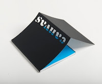
My final publication can be seen below. I photographed these images as professionally as I could to show my work as well as possible.


In conclusion I feel this project has worked well. I have successfully created a publication that teaches students what the CMYK and RGB colour modes are and when to use them within design. This informative book is appropriate for my target market which I highlighted as important at the start of the brief and feel due to its unique and eye-catching qualities will attract this audience.

_____________________________________________________________________________

OUGD405 - Study task 02 - symbols

Today's study task will give me a better understanding of pictograms and symbols. The information and skills learnt in this session can be put to use within my way-finding brief to help better convey a message I may wish to produce for my project. The task has us creating a monotone pictograms for a chosen Olympic sport.

Before experimenting with my own ideas I looked into previous Olympic pictograms for research and inspiration. I found the pictograms used were often abstract and were more complicated than just a stick men doing sports. 

Some examples such as those from the Beijing Olympics used flowing lines and took out sections of people and objects whilst others were more detailed showing the curvature of an athletes body. Some examples can be seen below.

Beijing


Other pictogram examples within the Olympic history show colour and the use of negative space being a largely reoccurring theme throughout. With one single design it wouldn't be appropriate for my link to be colour but it is something to note for use within my own way finding brief. 

London

Munich


These pictograms have influenced my own experiments. I wanted to create a design with short flowing lines creating a more minimal pictograms. I started with preliminary drawings in my sketchbook and on gridded paper. Once I was confident in my design I created a final pictogram on illustrator. 


i tried to use minimal and little mark making to produce my design as I didn't want it to be necessarily very obvious what sport was. I found it was a fine line where my pictogram changed from being legible to hard to understand and it was because of this that I drew more experiments on paper before moving to the mac than usual.

OUGD405 - Studio Brief 1 - way finding

Our new studio brief tasked us with re-designing a way-finding system for a building of our choice.

The briefing led me to try explore different types of way-finding examples throughout Leeds. In a small group we set out to visit museums such as the Henry Moore, Leeds Art Gallery, Leeds train station and Trinity. These places showed varied responses to way finding so helped with expanding my knowledge of different methods.

After looking at various examples of both successful and unsuccessful signage around Leeds I found that the way-finder examples that worked best were those where directions were clear and easy to use rather than those that tried to cram in too much information. Because of this I decided it was important to use a minimalist style where function has priority over form to produce a more successful project. Despite this, the end result must still be aesthetically pleasing and appropriate for the environment I choose to re-design. It is therefor important I find the right research to help push me in the right direction.
_______________________________________________________________________________

I combined research from looking around Leeds and what I found on the internet and in books and decided to re-design the way finding methods in and around iQ student accommodation. As this is my halls of residence so my research and understanding of the environment is already of a high level. This will be beneficial to me later in the project when trying to appropriately experiment with the location in mind.

IQ is one of the largest student complexes in Leeds with over 200 flats however there are 3 blocks that separate the premises. Each block has a different layout that comprises of a mixture of long straight corridors and tight corners which makes it extremely difficult to navigate especially when you haven't been before or if you are intoxicated. Being student halls, there are often drunk people present trying to guide themselves around the complicated layout after a night out. I hope to create way finders that are legible day and night and whether intoxicated or not. Other features include the reoccurring colours of purple and green and their bold and striking logo. These are important features I feel I must include within my designs to accompany it's running theme. iQ also has a main gate with passage for both by car and on foot however there is little clear signage towards reception or blocks. I feel this needs to be improved when redesigning its way finding ideas.

I looked to designspiration.net to find inspiration and contemporary designs. There were a large number of way-finding methods that display the minimalist styles I had hoped to find. The designs that worked best were those with clear, legible type. This would lead to an easier experience for the user with little effort needed to understand the way-finder. The research I looked for included ideas that would work within iQ as well as more general way finding designs that worked well within their own environment.


Designs spread across corners work well with iQ's similar architecture. The visibility of some type may be obscured by the viewers position however, when stood in the right place, way finding methods such as this are successful and are aesthetically pleasing within context.

Recently I have visited Headrow house. A bar, restaurant and event venue situated in the centre of Leeds. The first thing that struck me when entering the venue was the well designed way finding techniques used throughout the venue. This was a design by Leeds based design company alphabet.Their use of minimal and monochrome signage works well within its dimly lit surroundings. The designs are placed onto light boxes which helps with legibility and are a modern example of  good way finding techniques. Some of the design features around Headrow House should be taken into consideration within my own project as will help complete a more modern approach to the brief.


Light boxes such as those seen within headrow house could illuminate the dark hallways of my own accommodation. This can be seen within the above design example. The thin strip used for way finding condenses the type making it almost illegible especially from a distance. This is something I have to avoid within my own design as the clarity of type and ease of use is something I have identified as being an important aspect. Despite this, I like how the way finding makes the most of the negative space with information of various things such as floor number and room number (also things I must show) separated from each other to avoid confusion.


I have found an example of successful way finding for Hotel Voskresenskoe in Russia. The way the designers have used way finding to show off the building's long hallways is something I would like to replicate within my own work. The building uses only pictograms and lines to direct the user through the area with the only type being shown all in one place on the key. This simplistic method means it is universally understandable with any guest from any country being to walk around the building with ease.


I found a number of way finding ideas where designers have displayed directions on the floor. Although aesthetically looking good, these methods of signage can sometime go missed due to the lack of interactivity with users and the floor. This method can often be costly due to the need to print designs onto carpet or other less used materials. Despite this, I like the idea shown in the image below where way finding may start on a wall and move onto the floor as a guide to follow. I hope to experiment with using the floor as a way fining technique as finding your way through iQ may be difficult with the use of arrows on a wall.


A large amount of research found used colour to differentiate areas of a building. Often these colour codes make it easier to get around such places. I feel this is something I could look at for my chosen environment due to the three different blocks, and large amount of floors in each building. The examples I have found use colour in different ways whether it be to single out a particular piece of information on a board using negative space or direct someone to a specific platform within the New York subway system.


_______________________________________________________________________________

I took photos around iQ of signs and way finders on display of which I found there to be very few. Those that I did find were often hard to read especially late at night due to types places on a black background.

The lift lacks any successful design features with the only information being a laminated A4 sign.

All signs are small and can be hard to see and read which is something I wish to improve on as is not appropriate for this chosen environment.

With a visually similar sign being shown as you exit the lift or staircase on each floor, the only place to see the currant screen is the small lift display. The use of floor signs is common in such places as hotels and carparks so find it to be unusual within such a complex setting.

Numbering on flat doors is hard to read due to its small size. Although not a priority as these are still legible I feel that they could be changed to better work with the target audience.
_______________________________________________________________________________

I found there to be a large amount of signage at iQ containing type. Through lectures and research I now understand that this can be simplified using pictograms. Such places as the laundry room, lift, gym, reception and study room could be signified by a simple illustration which universally communicates what it is across any language due to general knowledge of the place or activity. This in turn makes way finding easier and so may be a solution to the idea of getting lost within iQ.

I found a number of examples of way finding pictograms on the internet and when exploring the college. These (shown below) demonstrate how they can be used within an active environment. I hope to reproduce a series of design experimentations as an idea for my project.


Due to my environment being a student accommodation there were a number of places in need of pictograms. I decided to list these to make it easier to experiment with. I created this list by walking around iQ and finding signage that could be adapted into my own pictograms.
These places are:

The gym;
The laundry room;
Reception;
The lifts within blocks;
stairs;
games room and
car-park.

I first experimented in sketch form. This meant I was able to generate a large number of concepts quickly giving me more ideas to work with when finalising the designs. These were often very basic and sometimes included only a few lines when mark making. Due to iQ only having a small amount of places available to pictogram I was able to experiment more with the ideas for each single environment creating more successful final designs.


From these sketches I moved the designs into illustrator. I decided to use simple yet clear pictograms to symbolise my accommodation to work alongside my intended design process for other way finding methods. I split lines up into fragments for some designs which simplifies each pictogram further. Once I had done this I thickened each line. Now each pictogram is unique, clear and stands out whether small or enlarged which is important when trying to continue with creating a legible design.
_______________________________________________________________________________

Before starting my design process I wanted to decide what typeface would be most appropriate for my project. The typeface must be clear, modern and legible. As well as these common features, it must work well with the current design of iQ as to work cohesively and not be harsh on the eye. To do this I decided it was important to choose a san serif typeface due to their legible traits. I also noticed that serif typefaces were less common with way finding design.


I looked at a number of modern san serif typefaces I thought would best suit iQ's current branding and my ideas for the way finding. I felt most worked well however I decided quicksand's rounded lettering created more playful and child-like ideas so wasn't suitable. Some other typefaces didn't work so well also such as helvetica and arial as they are commonly and so regularly used. Despite these decisions I did find some of the fonts successful. I hope to experiment with some others within my work to see which will work best.
_______________________________________________________________________________

I started to experiment with some way finding ideas focusing on creating designs that are clear and legible but also informative. These were some of my original sketches. I was first inspired by the light boxes of Headrow House and their minimalist approaches. This can be seen within the monochrome designs. I wanted signs to look spacious and easy to read and feel this has been accomplished.


Although contemporary and clear I don't feel these designs fit with the overall theme of iQ. It's dimly lit and doesn't comply with the currant branding using the colours black, purple and green. I also feel the designs are similar to the currant signage which I had already decided didn't work. Because of this I decided to look at other ideas.


I created these designs to signify the floor when navigating the student complex. They show a large block of colour with large type. This stands out and works well with the importance of legibility. I played with the positioning of type around the coloured shape and found it is at its clearest when expanded from the top to the bottom of the graphic and so this is the idea I have decided to pursue. I added more of the block colour the the right of the text. The extension caused fits in well with the idea of linking to iQ's long corridors. As the numbers stretch across the whole design they appear to be attached and at one with the block colour. This caused me to experiment with taking away sections of lettering such as the outline and inner sections of '5'. These examples can be seen below.


At this stage I was still unsure which typeface would be most appropriate so these original designs often use different variations. One typeface I feel works well for this project is Alte Haas Grotesk. The aesthetics of its rounded numbers work well with iQ's continuing themes however I don't feel its letters work so prominently within the designs I have created. Because of this I have decided to use the typeface Futura in further ideas with type. I feel like this typeface is more appropriate than Alte Haas Grotesk due to its thicker strokes creating a lighter contrast between type and colour block. The more condensed type creates a more flowing design by linking design features together however I will use Alte Haas Grotesk for numbers as works better on this hand.


I looked further towards the use of colour and how they could separate different areas of iQ. I found the best method to be portraying each block of the accommodation as one of the three used colours. I used the same grid system layout throughout the three designs changing only colour and what type was written. This consistency works well throughout the way finding designs of iQ, continuing my successful idea incorporating large blocks of colour and type.


As mentioned previously, iQ has a number of common features such as long hallways and a large number of corners. I have already included the long hotel-like corridors within my design ideas. The addition of added rectangles to my currant design gives the idea of corners within hallways. The corners on each design are different to one another and contradict the previous designs where all graphics were the same size and shape. This is a concept I asked my fellow course mates during a critique and received positive feedback about. An example of my first experimentation of this can be seen below. I feel this is a successful attempt to combine the features of iQ within my design. Despite this there are areas I would like to address with the help from my upcoming critique.
_______________________________________________________________________________

The feedback I received during this crit answered more of my own questions about my project such as how I could expand ideas such as using corners and expanding on the use of pictograms. I was given the idea to work even more with colour and different shades of the purple, green and black I am already using. I wanted to do this over more way finding pieces to work along side and cooperate with the target audience.

I have created another piece of way finding in conjunction. I have created a poster to work inside the lift. It is to replace the currant A4 laminated piece that tries to navigate which floor takes you to where. I tried to design the piece with the map design in mind. Using the same style will connect all elements of my design together and link with its currant branding which is what will add to a more successful way finding design.

_______________________________________________________________________________

Now my ideas had been constructed onto illustrator I must create mock ups of my designs. Within professional practice this will show the client how my work will look within the actual environment so is an important procedure. With some past experience in the Adobe creative suite and additional workshops at the college I am able to complete the task. Despite this I find it difficult for my designs to look realistic when placed onto photos. This is something I must work on. I hope continuing experiments will help to add to my progress so my finals are more professional looking than they currently are. 


Examples of my current experimentation with mock ups can be seen above. Although I am working on improving realist qualities I feel the wrapping of designs around corners is something I can take from these examples. With this and the addition of added rectangles showing the corners all features of iQ link up creating more cohesive way finding designs.
________________________________________________________________________________

I think my final mock up designs of iQ student accommodation's way finding replacement would work well in the the environment they were designed for. The large type that spans across the walls show how the dark corridors can be brightened up by colour. Better way finding has also resulted in easier navigation of the premises with a more clear route seen from gate to flat. As well as this, it is now clear where the reception, bike shed and gym are. With a clear way finding final, I feel I have successfully accomplished this brief. I have adhered to the issue raised about the current design and produced a solution that also solved problems I have noticed.