We have been tasked with designing a logo for the Yorkshire
sculpture park purely comprising of symbol. This must be able to accompany type
for promotional leaflets and posters as well as work by itself. I wanted to incorporate things into my design that would make it unique such as using negative space, shadows and silhouettes. This is predominantly what I looked at when visiting the park. I photographed a number of sculptures and specific points of interest that I could base my designs on but found it quite difficult to think of a particular image that can best represent
YSP as a whole. The majority of my photos comprised of the permanent sculptures
at the park. This gave me a good starting point as I started drawing out
various ideas.

After asking a number of people about their opinions on my
designs, I came to the conclusion that basing a logo on a particular sculpture
would not show the varied amount of artwork the park has to offer and so began
designing logos based on a wider range of things such as silhouettes of
buildings and the grounds. I looked at the walkway leading to the parks main building that shows all those that contributed to the making of YSP. Because this is such an important feature of the park as without these people

When walking through the park I noticed how undulating the location is with different galleries dotted around it's grounds and decided I wanted to recreate this within a design. I extended the flowing hills theme with wavy lines across the sky and landscape representing the parks features. This was one of my only designs where I experimented with a colour pallet. For others I felt they worked best as monochrome images. This also means they can be used across a broader range of media however it was hard to differentiate the hills from the sky. I do like this design but feel it hardly communicates YSP. This would work better with type but as this wasn't part of the brief I had to try show the park through design decisions of my own. This was difficult so felt this design didn't work as well in comparison to the others when put into context with the brief.


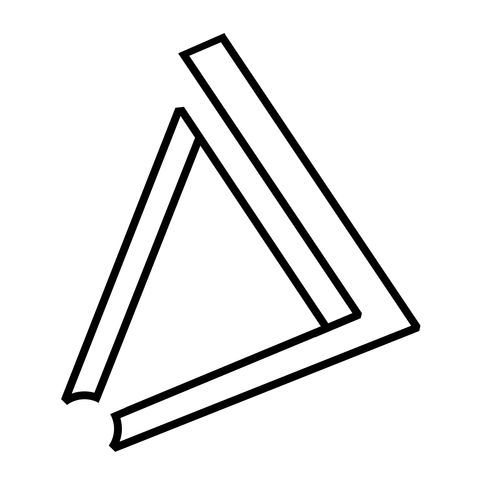
I did some additional research on the park once at home and found out it was part of a larger group of galleries called the Yorkshire sculpture triangle. This comprises of YSP, The Henry Moore institute, Leeds Art Gallery and The Hepworth. I looked at the placing on a map of these places and sketched them out as ideas. After playing around with adding lines and other marks to the design I noticed it looked similar to a Penrose triangle so based a design on this outlining YSP with negative space on the map. I think this works well as a design as could be used throughout the Yorkshire sculpture triangle’s galleries by just moving the negative space to different points. The design I came up with is simplistic and can work for various things around the park such as signage, leaflets and merchandise like tote bags and postcards. Because of this I feel this is my most successful design and is the one I am most likely to submit to clients.

No comments:
Post a Comment