Todays brief tasked us with re-designing the cover of an
Agatha Christie novel. The title I was given was “They came to Baghdad”. I first looked at previous interpretations of the book's cover as found it hard trying to interpret the title as first sketches due to it being vague and not informative. These covers often tried to portray Baghdad either through photography or illustrations and hardly showed any relation to the plot of the book itself.

As I wasn't familiar with the plot of this book. I first read summaries and watched reviews which helped me recognise key events that may influence my design. A key source was a review on youtube by anskov which informed me about main events in the novel such as the killing of a British secret agent. It was from this that I created a number of designs that best portrayed the death. These preliminary sketches worked well and so I decided that this was one thing I hoped to base my poster on. I also felt it was important to look at how I could link my poster to Baghdad. I first tried to use the same idea that other books had, this was to show the city as a skyline, using the buildings in the distance as a clear link to the location.
These two ideas worked well separately but decided I wanted to involve them both within my design process. I experimented with showing the skyline through the window of the hotel window where the spy was stabbed. This would involve both a link to the location and plot to to the book. Despite working in theory, I had several attempts at creating such image. This didn't really work as felt the image looked too busy which is something at the beginning of the brief that I felt I should avoid.
These two ideas worked well separately but decided I wanted to involve them both within my design process. I experimented with showing the skyline through the window of the hotel window where the spy was stabbed. This would involve both a link to the location and plot to to the book. Despite working in theory, I had several attempts at creating such image. This didn't really work as felt the image looked too busy which is something at the beginning of the brief that I felt I should avoid.
I looked to other Agatha Christie novels in the hope that they would give me some sort of inspiration for my brief. From this I noticed that newly published copies of the books were very simplistic and used block colours to identify to the reader what the book was about.

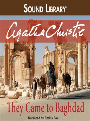
I noticed these illustrative covers all used a large amount of negative space as well as introducing small hints to the novels content. These were similar to the cover I hoped to produce but in my own unique style. With these covers as inspiration I decided to use a limited colour pallet. The obvious colours related to crime and murder were involved in my design process such as red and black but I also looked at less obvious colours. These choices were helped by Danny's lectures on colour theory where I thought more carefully about what colours would work together and the different pantone shades I could use to better represent the book title. After struggling to combine all aspects of the book into my design I talked to Simon. He gave me the idea to think of the design in more simple ways such as looking at using just type or focusing on the colour aspect more than elements such as illustration. This was similar to a book cover already created for they came to Baghdad. The typeface used appropriately communicates the the era and location of the book setting. This way of conveying the book so simply works really well and so is what I looked out for when finding a typeface for my own design.

 The colours used within the above cover replicate that on the Baghdad flag. This is something I hadn't realised previous to researching but found to be a good source on which to base my own colour way and how to influence Baghdad into my design. This book cover shows the flag at it's very basic with the only resemblance being the colour. I wanted to expand on this and decided to try adding other elements such as the green stars as well as a black bottom half of the poster.
The addition of the black and red into my design linked with the death and spy theme of the book so is something I stuck with. I felt that keeping my design to the flag only idea was too basic so added the idea of the the dead spy. To do this I started sketching out silhouettes of what I thought looked like a stereotypical agent lying dead on the floor. As a silhouette it would work with the black of the bottom of the flag so brought these two components together.

I noticed these illustrative covers all used a large amount of negative space as well as introducing small hints to the novels content. These were similar to the cover I hoped to produce but in my own unique style. With these covers as inspiration I decided to use a limited colour pallet. The obvious colours related to crime and murder were involved in my design process such as red and black but I also looked at less obvious colours. These choices were helped by Danny's lectures on colour theory where I thought more carefully about what colours would work together and the different pantone shades I could use to better represent the book title. After struggling to combine all aspects of the book into my design I talked to Simon. He gave me the idea to think of the design in more simple ways such as looking at using just type or focusing on the colour aspect more than elements such as illustration. This was similar to a book cover already created for they came to Baghdad. The typeface used appropriately communicates the the era and location of the book setting. This way of conveying the book so simply works really well and so is what I looked out for when finding a typeface for my own design.

 The colours used within the above cover replicate that on the Baghdad flag. This is something I hadn't realised previous to researching but found to be a good source on which to base my own colour way and how to influence Baghdad into my design. This book cover shows the flag at it's very basic with the only resemblance being the colour. I wanted to expand on this and decided to try adding other elements such as the green stars as well as a black bottom half of the poster.
 The addition of the black and red into my design linked with the death and spy theme of the book so is something I stuck with. I felt that keeping my design to the flag only idea was too basic so added the idea of the the dead spy. To do this I started sketching out silhouettes of what I thought looked like a stereotypical agent lying dead on the floor. As a silhouette it would work with the black of the bottom of the flag so brought these two components together.

No comments:
Post a Comment