Strada
This typeface is used recurrently on the website and is legible at most sizes. The modern font is one of Monotype's own and so will be easily recognisable for my app. I will use this for most of the text within my applications.
Malabar
This font is used less within the website however its unique qualities may help for my app to stand out against others, making it more recognisable. Despite this, I feel the font may be difficuly to read at smaller sizes and becomes less appropriate in more cluttered layouts.
The monochrome colours are used for the majority of design however the blue is used for highlights and selected elements to help them stand out. These colours will be used within my app in the same way so the two interfaces are clearly linked.
Now my preliminary decisions have been made I will start to create my app.
Home Page

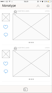
I first created two designs for the social media aspect of my app. It is important that all features are clear and accessible from this first page. I experimented with both small and larger photos however feedback found that the photos were too small on the left and the layout looked very similar to Instagram on the right so I needed to experiment. The '...' icon has been used to extend the post and give the user further options such as commenting. The use of the heart and comment icons was found to be too busy alongside the photo so the '...' became useful to hide it.
The bar at the bottom of each example interface is placed so users can easily access the camera however from feedback, I found this could be easily pressed when scrolling so I must look to move it to a more appropriate place.
Extending a photo
I created a simple interface that opens when a photo's '...' is pressed. The comments are clear and can be scrolled through with ease. I decided to not use an icon for liking the post and instead double clicking the photo will surround the photo with a blue border to show the same. The '...' will do the same when someone has commented.
 Looking at selected typefaces
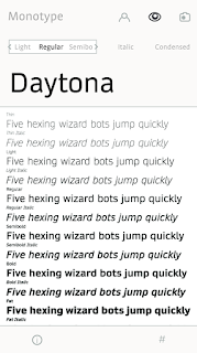
I wanted users to be able to see a particular font in all its forms when they clicked it. My layout gives the option to see their own text in the desired font and change it to any characteristic they need. Information is given using the i icon whilst tagged photos can be seen with the # icon. All other parts of the app are still accessible using the bar at the top.
Users are limited to four captions so posts won't move away from the subject of type. Options to crop and go back a step are placed in the below bar.
Finding a font through questions
A typeface can be found by answering a series of questions that lead a user to the final example. I tried to make the layout for these questions as simple as possible so user can be guided through with ease. If the correct typeface is found, you are lead to the fonts information page.
Catalogue of typefaces
A users desired font can be searched by name or scrolled through to be found. The name uses its own typeface so a quick glimpse of what it looks like can be given.

Profile
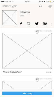
My first profile design is more cluttered than some of the other interfaces I have created for this brief but must fit more onto it. Users can connect together using other social media links such as Behance and Instagram however can also find new accounts and follow them accordingly.
Other interfaces I have designed for this app can be seen below:


No comments:
Post a Comment