Wednesday, 14 December 2016

OUGD504 - Adobe Xd

This brief asks me to create prototypes for my brief that are working, animated or navigable. Despite taking part in a number of After Effect workshops to improve my animations skills, I have found the beta program: Adobe Xd to be very useful in the design process. Rather than spending time animating each individual moving element, I can work on the app as if I am using it. This gives me a better idea what it will look like as a finished product and brings me closer to professional design when I would use a similar program to show the client.

One useful feature of Adobe Xd is being able to record yourself as you try out the app you've created. Once I have inserted all images into my app I will use this feature. I then hope to insert this video into Adobe after effects, adding an iphone to the background. I hope this will then make it more engaging for the viewer.

My first experiment with Adobe Xd can be seen below. Although some icons and links are not yet working and photos are missing, I feel it is slowly coming together.


Saturday, 10 December 2016

OUGD504 - Critique with Only and further development

Recently, design studio Only came in to help give feedback on work done so far for the design for screen brief. I showed the developed wire frames I had previously produced in illustrator. At this point in my design process I felt I had a near complete idea as I understood what features I would be including and had started designing my app on illustrator. However, the critique outlined a number of issues which my peers felt needed improving.

The first suggestion focused on my aim for the app to work as a research tool for people to look for and find the most appropriate font for their own work. My peers felt the app's social media aspect should include a way for user to ask others what they think the best font would be for use within their project. This feature could be easily created by giving users the opportunity to add another caption option. Users can ask: What font do you think would work best? so help can be given with ease.


The group also proposed I added a way for users to download a font they may like. To improve this I will add a simple icon, taking users out of the app to the appropriate source.


My peers noted that there was no incentive for users to comment on other people's work meaning people may be less likely to use the app. One option suggested within the crit was to include a 'like' system seen on other social media apps, where users are rewarded for answering a post correctly or giving feedback on work. This would sit alongside the number of followers on each persons profile.


One thing that was noted as successful during the critique was how there were a number of different ways for people to find the typeface they are looking for. This was something my peers felt was the most important feature so should be accessible wherever you are on the app.

One final thing that was suggested during this critique was to look more extensively at other type finding applications and companies. Examples given include: Font Matcherator, Identifont, Typekit and Whatthefont.


Wednesday, 7 December 2016

OUGD504 - Designing my app

Now my wireframes are complete and I have a good idea how my final app will look and work, I will start the design process in illustrator as it is easy to use and I will easily be able to create exactly what I want. However, I will look at a number of important design decisions first. After looking through the Monotype website, I found two typefaces I wiill consider for use within my own app.

Strada

This typeface is used recurrently on the website and is legible at most sizes. The modern font is one of Monotype's own and so will be easily recognisable for my app. I will use this for most of the text within my applications.


Malabar

This font is used less within the website however its unique qualities may help for my app to stand out against others, making it more recognisable. Despite this, I feel the font may be difficuly to read at smaller sizes and becomes less appropriate in more cluttered layouts.


Research into current, modern app design and the Monotype website has shown me that the colour scheme within this project must be clean and simple. I have decided to use the same colours as Monotype these are:
The monochrome colours are used for the majority of design however the blue is used for highlights and selected elements to help them stand out. These colours will be used within my app in the same way so the two interfaces are clearly linked.

Now my preliminary decisions have been made I will start to create my app.

Home Page


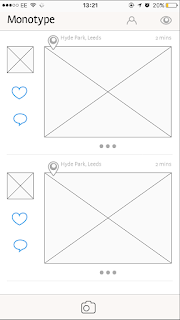
I first created two designs for the social media aspect of my app. It is important that all features are clear and accessible from this first page. I experimented with both small and larger photos however feedback found that the photos were too small on the left and the layout looked very similar to Instagram on the right so I needed to experiment. The '...' icon has been used to extend the post and give the user further options such as commenting. The use of the heart and comment icons was found to be too busy alongside the photo so the '...' became useful to hide it.

The bar at the bottom of each example interface is placed so users can easily access the camera however from feedback, I found this could be easily pressed when scrolling so I must look to move it to a more appropriate place.

Extending a photo


I created a simple interface that opens when a photo's '...' is pressed. The comments are clear and can be scrolled through with ease. I decided to not use an icon for liking the post and instead double clicking the photo will surround the photo with a blue border to show the same. The '...' will do the same when someone has commented. 


Looking at selected typefaces

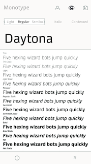
I wanted users to be able to see a particular font in all its forms when they clicked it. My layout gives the option to see their own text in the desired font and change it to any characteristic they need. Information is given using the i icon whilst tagged photos can be seen with the # icon. All other parts of the app are still accessible using the bar at the top.


Posting a photo

Users are limited to four captions so posts won't move away from the subject of type. Options to crop and go back a step are placed in the below bar.


Finding a font through questions


A typeface can be found by answering a series of questions that lead a user to the final example. I tried to make the layout for these questions as simple as possible so user can be guided through with ease. If the correct typeface is found, you are lead to the fonts information page.


Catalogue of typefaces

A users desired font can be searched by name or scrolled through to be found. The name uses its own typeface so a quick glimpse of what it looks like can be given.


Profile

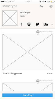
My first profile design is more cluttered than some of the other interfaces I have created for this brief but must fit more onto it. Users can connect together using other social media links such as Behance and Instagram however can also find new accounts and follow them accordingly.


Other interfaces I have designed for this app can be seen below:


Saturday, 3 December 2016

OUGD503 - Penguin - evaluation and final cover

Being my first brief within the responsive module, I felt it was essential that I planned my time well and produced appropriate outcomes in time for the competition deadline. My vigorous research at the start of the brief has produced well informed final results that work well for this crime novel. 

The ambiguous shoe print design came about through research on the murders crime scene photos. Experimentation through hand drawn sketches and designs on illustrator progressed quickly and gave me a good number of layout ideas to bring to a final critique. Further experimentation with type also helped build a response that looked like a crime novel sat on a shelf.

Feedback sessions such as the final critique influenced my work greatly within this brief as told me how I could improve my work so far. These feedback sessions also showed me what stage I was in comparison to others doing the brief. This helped me to plan my time well and deliver my outcomes the best I could.


Overall, I feel this project has been successful. The conceptual outcomes were suitable for the target audience and adhered to the points set within the brief.


Friday, 2 December 2016

OUGD504 - icons

Having previously looked at icons within my research, I noticed their importance within my app. I went through my wire frames so I new which icons I would have to design for my app. I found there to be 7 icons needed which are listed below. 

Home button
Own profile access
Finding typefaces manually
Info about chosen typeface
Location
Tagged photos
Searching for typefaces
Camera
Cropping photos

I experimented with a number of options on paper first. My chosen designs were then recreated on illustrator.


OUGD504 - Critique

The Feedback from my critique was almost entirely positive. My peers swayed towards the Monotype idea because of the social media aspect which could connect users (including professionals) together. They felt this solution was more relevant to the brief and has potential to expand with further features especially using the hashtags for research use. Despite this, one person noted that the monotype wire frames were quite similar to the design of Instagram. I will make sure my final designs have unique qualities that separate themselves from other apps. The next stage in this design process will be to expand on my Monotype wire frames and start designing the app itself.

OUGD503 - Penguin - Type Experiments

I experimented with type in a number of ways. I first looked at what typeface would be most appropriate for heading and body copy, then how type could be best placed on the page in relation to image and white space. It's important that these design decisions consider the brief; focussing on being shocking and in tune with the book.


I used san serif typefaces within my experimentation as felt they best convey shocking emotions. Out of the typefaces I looked at I found Trebuchet to be most suitable. This came after consulting a number of my peers on my options and ideas behind their use.


I wanted my type placement experiments to be bold and in caps relating to shocking themes. I came up with different options to work around my shoe print design on the front of the book cover. The examples can be seen above.

Thursday, 1 December 2016

OUGD503 - Penguin - Layout Ideas

I sketched out a number of layout ideas for my shoe print based on my extensive research on book covers. I looked at doing this in a number of distinctive ways so I had a number of options for progression within the brief. I first sketched my ideas out on paper so I had a vague idea what I wanted to produce. These can be seen below.


I then moved to illustrator so I could replicate my ideas digitally and get a better idea what my final cover may look like.

idea 1


idea 2


idea 3


Wednesday, 30 November 2016

OUGD504 - Wireframes

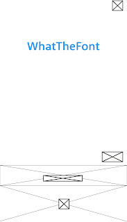
Although previous critique feedback has pushed me towards my Monotype app idea, wireframes for at least 2 ideas are to be brought to my next critique so I have decided to develop the WhatThefont ideas further.


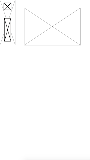
I sketched a number of different home screen options (seen above). Each focuses on the ease of use for the user. A simple slide up/down on the first idea and left/right on the second means the user can access the camera and camera roll straight after opening the app meaning fonts can be checked in seconds. These would be clearly separated using different colours making them easily distinguishable.

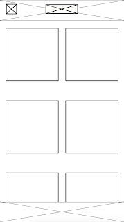
I created a number of options for a navigation bar which helps the user move around the app with ease (below). The option of the left drops down from the top left of the screen and is easily hidden so users can see more of the screen. The example on the right drops down from the top of the screen and is very similar to example of navigation bars within research. 

The interfaces below were created for users to select photos already on their camera roll. The simple layout in clean and easy to use making selecting photos a quick process.  


When an image is selected it can be cropped to help the app find the correct letterforms. The simple layout to do this can be seen below. Limited icons and large amounts of white space helps the user easily move through each stage of the font finding process.


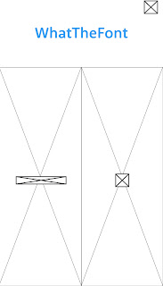
When a user decides to capture type straight out of the app, the image will be scanned so each letterform can be detected. The previous interface for this on the What the Font app is dated and difficult to fill out. My new design focuses on each letterform per screen making it easier to understand.


The final stage in this apps design gives the user a number of options for which typeface it could be as the app is often inaccurate. I wanted this to stay simple but let the user easily look at the type in use.


_____________________________________________________________________________

As I wanted to develop the Monotype app more than the first idea, my wireframes were more detailed and I went into depth within my notes.


Monday, 28 November 2016

OUGD504 - Site Map

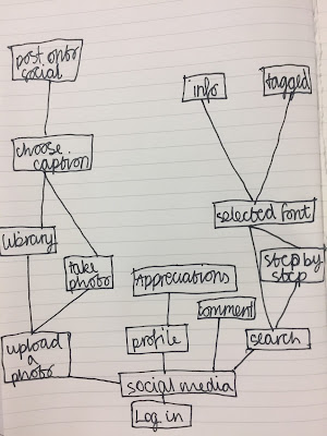
Site maps are a useful stage in the progression of a digital design. They can help show the designer and developer how the interface will work interactively. My sketches will also help in the production of my wireframes so are an important part of the design process.


Saturday, 26 November 2016

OUGD504 - placement of elements within an app

After extensive research on apps and mobile interfaces, I noticed that interactive elements were often placed at the bottom of the screen to minimise how far the finger needs to travel to touch it. Despite this, I noticed that important information and icons within apps (such as the home button on Facebook and Instagram) are often placed at the top of the screen making them easier to view for the user. These are things I must consider whilst designing my own app.


The size of icons/buttons within an app must also be considered. Icons must be big enough to see and touch yet should not overcrowd the interface. When including these interactive elements within my design I will look at the sizes other apps and competitors use for inspiration.

Friday, 25 November 2016

OUGD503 - Penguin - Developed ideas

Feedback from my critique told me to focus on my shoe print idea however I must continue developing this concept through sketches. I first looked at illustrating the image I found by hand.


I then decided to try digitally manipulate the image in a number of ways to see what I could produce.


I decided to ask a number of my peers on their opinions on my designs, noting the half tone designs looked a little . They proposed that I experiment with the position of the shoes print extensively, looking at how type can be placed in conjunction to image and how this can effect how the cover is portrayed. This will be done using sketches however my favourite designs will be brought to screen for further experimentation.

I must now look at how I can include the mandatory typographical elements such as the title, authors name and blurb (etc) on the front, back and spine. This should be informed by my research on other book covers and the brief requirements.

OUGD504 - Time plan

It is good to get into a habit where time plans are common place within briefs. They can prevent rushing, not being able to finish work and can help when juggling more than one brief at once. As OUGD504 runs alongside other briefs such as responsive and COP, I feel it is important that I keep to my schedule so I don't lose track of the work I am doing.

As I have not properly started the design aspect of my brief, I have decided to list what I have left to do on the brief in the time I have as this will help me more than a detailed time plan which I may not stick to.

Wireframes

Mock ups

Developed ideas

Elements within the app such as icons and added features Creating my app on XD

Final video

Evaluation


Thursday, 24 November 2016

OUGD504 - Icon Research

I researched into how icons have been used in existing apps. Looking closely at what worked well and could be applied to my own work as well as what was less successful and should be avoided. I looked first at social media apps as there would be similar features to what may be seen within my Monotype app.

Instagram


The icons that Instagram use are simple and reflective of its layout. They are easily recognisable yet unique to the app and will therefor inspire my own icons.

The bottom bar of icons stays the same throughout the app meaning the user can navigate to any page at any time. This is a useful feature to include within any digital interface and is something I should consider using within my own app.

Facebook


Facebook has a more complicated layout to Instagram because of its extended features however icons remain simple. There are more unique examples that don't appear on other apps however their purpose is still obvious making it easy to navigate through the app. Recognisable icons such as the hamburger (seen below) are also used recurrently, this is used to show a drop down menu (above right) where further pages within the app are made accessible.