Showing posts with label OUGD503. Show all posts

Sunday, 13 May 2018

OUGD603 - Year Book - Designing photography year book

As this book is so long and the time frame is only short Ben and I decided to start designing. We first produced a grid system that we would stick to throughout the publication. Consistency in layout is essential throughout the book so we determined that we would be strict with how images interact with this grid system.


Once the text on each page was determined, Ben started adding images to the page, however this would be changed substantially later in the design process. This was because we later decided that each page would be designed specifically to the images on the page rather than them follow a pattern as the 49 degree concept focuses on how important each individual person on the course is.


After Ben added each of the images to their respected pages I sat down with him and gave my opinion on each page. This included where images should go in relation to the grid and other images on the page, where the photographer names and projects should go and the use of page numbers. This part of the process became more of a collaborative part of the design process as Ben and I sat down and designed it together. This led to a more successful design outcome as we were both able to input our different ideas. Repeatedly going over the layout as we did gives us a fresh mind each time we go back to the top. This means we are able to spot any imperfections and change them with ease. Whilst doing this we were conscious that each of the pages work next to each other. One example of this was varying where full bleed images were in the book.


After producing this draft we decided on changes such as putting the book in alphabetical order by last name. This is how you should order names and felt it would be more appropriate for the book as it is also how their register is ordered. We were also able to refine the layout further as a fresh look at the pages gave us the opportunity to almost start again. The contents page I designed for the Graphic design year book was kept as shows each name in a more unique and interesting way. The equal spacing between each text signifies the consistencies in grid and design within the year book and also relates to how each student is equal. Other improvements included adding information about each project at the back of the editorial. Although it meant the reader would be flicking from the front to the back of the book, the layout became more focussed around the photos linking to our initial idea that it is designed more like a photo book to display everyone on the course's work.

This draft also led to changes in the page numbers. I felt that each student should be designated a page number. This would then be placed in one of the corners and set to their respected degree so the number looks like it's turning when used like a flip book. This was one of my ideas that Ben first disagreed with, however after feedback from peers and showing him how it would look we both decided this would be the best way to show the numbers. 


After producing this layout we went to the tutor Orlando looking for feedback. This proved to be vital as we were able to get a completely new opinion on how it should both look and function. His feedback was predominantly positive and ideas for changes were often minute. This included showing the photographer's project title in Title Case on each page rather than uppercase as some titles may be more obscure (e.g. unTitleD). It would also contrast well to the uppercase name on the opposite page.

Orlando also felt the content page should be changed as the concept wasn't clear and he didn't personally think it looked as good as we had originally thought. He lastly felt the contact and information page should be on white not black as it was inconsistent with the other layouts in the publication. This feedback was taken on board and applied to to next, final draft.

Monday, 1 May 2017

OUGD503 - Up Yer Sleeve - Final design and evaluation

Overall I feel I have planned this short brief successfully as my outcome has been produced on time and to a high quality. Choosing to produce this brief within a week has tested my organisation and working under pressure. My final photographs are distinctive and have no obvious connotation to the song. This is something I outlined as important at the start of my brief and have considered throughout the design process.

My research into the lyrics of the song and evaluation of the video helped to develop my folded heard concept from small illustration to 100 photo final image. Throughout this however, my concept has remained key and is visible throughout the development.


The final outcome is portrayed through photography with is a response that wasn’t as popular within Secret 7’s finalists. Despite this, I’m hoping my ambiguous and conceptual response is liked by the judges of Up Yer Sleeve.


Wednesday, 12 April 2017

OUGD503 - Up Yer Sleeve - Final Critique


I brought some experimental images of my 3 finals (seen above) to a critique for feedback on which would be the most appropriate idea for development. I again showed my group the youtube song I was given so they had a good understanding of what I was working on. Each idea was at a different stage of development however I made sure my peers knew how each would progress to a final cover.

I decided to ask my peers within this critique which idea they felt was most appropriate, from which I found varied results. Conceptually, the group agreed that the folding heart idea would work best but as this idea was still in initial stages it was hard to see whether it would work as well aesthetically as the other ideas. Despite this, some members of the group felt this idea was the most appropriate adding how they felt a black background would work best however it would be good to experiment with white also. We agreed as a group that the photos should seamlessly merge together so the final cover designed looked less like a contact sheet and more like one photo.

I showed my peers the inspiration used for this idea as well as my experimentation as the idea couldn't be seen in its final form. Although all my crit group liked my illustration and use of colour to represent the upbeat nature of the song, they felt this had been done before. I therefore decided to dismiss this idea for this brief.

I received positive feedback about my typography response however I feel this is partly because this was the most complete idea. They liked liked the idea of using a grey background with contrasting colourful type as felt it represented the song well however suggested experimenting further with foiling and other traditional print methods. Although the group was swaying towards this idea, I didn't feel it would work as well as the other two in consideration.

Despite deliberation within the crit group, I have decided to progress with the folded heart idea, taking into consideration their added points for improvement. I feel this idea could work well as a more ambiguous response which could in turn help my chances in doing well within the competition.

Saturday, 8 April 2017

OUGD503 - Up Yer Sleeve - developed ideas

My last critique helped me decide on my three most appropriate ideas. These are the typographical response, folded heart and wax/ watercolour illustration. I first developed these further using sketches and moved on after using the most appropriate media.

Typographical response

I wanted to produce a typographical response based some of the lyrics  in the song. The lyrics that I felt were most appropriate for this were:

100 days for this heart to unfold

Wait a minute. Maybe I need to slow it down just a little. Take my time

I had a man tell me things. Made me feel just like a queen and I thought

I noted in my original sketches that I wanted to use an old American style font as this was used within the 100 days, 100 nights music video as well as on Sharon Jones' website. 


I wanted to also experiment with the colour of type within this response. Within feedback I found that responding to the song with colour would work well to link everything together. 


Folded heart


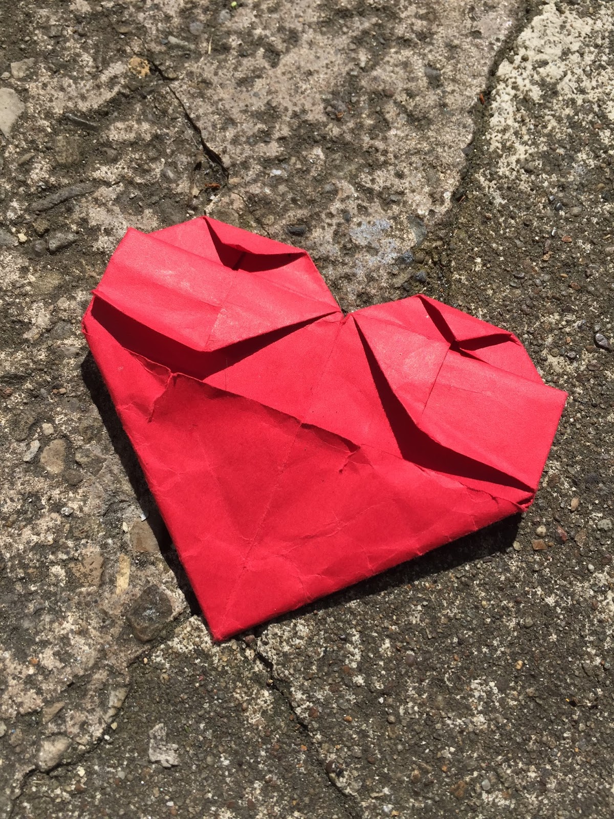
I experimented with a number of different hearts for this. First looking at origami where I produced a number of different results. Unfortunately, It may be difficult to produce 100 photos using this method however, it will be experimented with later into the project.

I also looked at folding a heart in my own way. The final look of the heart didn't look as good as the origami counterpart however there seemed to be more stages so may be more appropriate for the 100 photo idea. The first photos of these hearts can be seen below.


wax and watercolour illustration
I illustrated Sharon Jones' face a number of times in a number of styles so I knew which would be most appropriate for the idea. These sketches are seen below.


After working on each style, I came to the conclusion that the shadowed illustration worked best as more of the face would be seen when paint is poured over it. I produced a digital version of this as felt it would be more neat and work better than a hand drawing. This also enables me to print the design a number of times for experimentation.


Friday, 7 April 2017

OUGD503 - Up Yer Sleeve - Ideas and Feedback

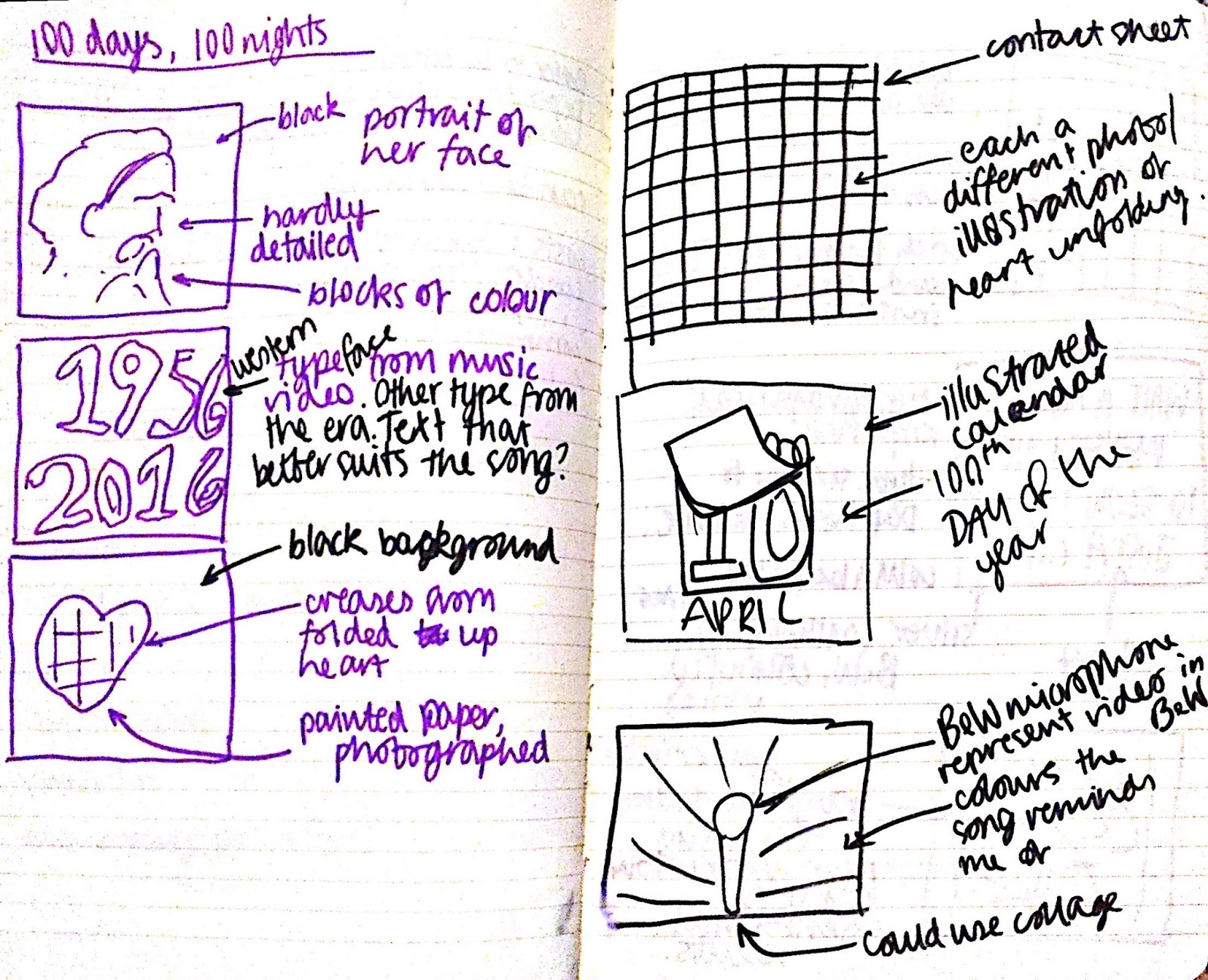
As this is a brief I will be completing within a short time frame, I have decided to start sketching some ideas straight after my initial research. I also feel that I now have good enough knowledge of the song and artist to produce good conceptual work. I first sketched a number of ideas to help start this process. These are seen below.


As I had 9 different ideas within my preliminary sketches, I brought this to a small critique for feedback and help with my development. I first played the youtube video of my song to my critique group so they had a better understanding 

1. Which ideas do you think are conceptually the strongest?
My group felt the folded heart idea linked well with the meaning of the song. They felt that 100 different photos used similar to a contact sheet was most appropriate however one folded heart would also work well.

Another idea which was found to be conceptually successful was the typographical response using lyrics from the song. I feel that further development of this idea would push it 

2. Which sketched ideas best suits the song's upbeat and colourful melody?

The idea using wax and watercolour works well to represent the songs melody. To progress with this idea, illustrations will first be made then experimented with. Th

3. Which ideas don't work as well?


Despite preferring such ideas as the folding heart and... , my group felt that aspects of each sketch worked well and could be brought into my developed designs. This included using typography seen on music videos and the artist's website and experimenting with mixed media.

After taking part in this critique I have decided to develop three different ideas. These are the unfolding heart, the wax and watercolour paint of Sharon Jones and the typographical response using lyrics from the song. Focussing on three different ideas will give me the opportunity to choose the most appropriate idea through feedback later in the project.

Thursday, 6 April 2017

OUGD503 - Up Yer Sleeve - Research

I have decided to note down my initial observations from when I first watched the video sent to me by Cameron as felt these could be helpful within the design of my album cover.


I also looked over the lyrics of the song as felt they could influence some of my initial ideas. This helped extensively as I was able to take a few lines for further use.

These were Wait a minute
Maybe I need to slow it down just a little

100 days for this heart to unfold
100 days, 100 nights
To know a man's heart

But one day
I looked around
That old man
Was nowhere to be found

I started the research for this brief by looking at previous album cover for Sharon Jones and the Dap-Kings. The consistent use of orange works well to portray the upbeat song and her powerful voice and would be appropriate for my own design. 


I looked on Sharron Jones' website for inspiration and found the recurring use of western style typography. Using a similar font within my work for this brief would show a distinct link between the artist and record cover.


I also found similar typefaces being used within album covers of the same genre as well as alternatives that would work equally as well for the artist.

Other album covers

Finding typography from soul and funk albums has led me to look at other album covers from these genres.


The recurrent use of colour, especially blues and reds stand out and are popular for albums like this. The two examples above have background beams of light behind the subject in the foreground. This works well, especially for the genre and era the albums come from. I feel that an updated and more modern version of this would work well and will be looked at within experimentation.


Whilst looking at soul and funk record covers I noticed that many recurrently used mixed media. This usually focussed on photography and illustration together. This is used within Sharon Jones and the Dap-kings album: Naturally.


Tuesday, 4 April 2017

OUGD503 - Up Yer Sleeve - Brief & plan

Last year I was fortunate to be able to take part in Secret 7, a competition to redesign the album cover of a choice of 7 songs. Unfortunately, this competition isn't available this year and so 3rd year graphic design student Cameron Wolfe has created a similar competition for students at LCA. Unlike Secret 7 where I had the choice of which song to work on, I have been given 100 days, 100 nights by Sharon Jones. Having a more restrictive brief like this forces me to push my ideas further for this one song without spending too much time caught up on which song I want to redesign.

I have decded to give myself 5 days to complete this project to test time keeping abilities within a brief. I have created a vague time plan that I hope to stick to across the five days.

Day 1
Research
preliminary sketches
feedback

Day 2
pick 3 ideas to develop
develop sketches from feedback

Day 3
additional research
start final pieces

Day 4
feedback
develop finals and aim to have complete
by the end of the day

Day 5
finalise project, finish writing up

Monday, 27 March 2017

OUGD503 - Collaborative - Evaluation and presentation slides

This year’s collaborative group within the responsive module was different to other collaborative projects undertaken whilst on this course. Our team consisted of four graphic designers, each with different skill sets to produce an outcome for the Monotype brief. This was a vague brief which gave us the opportunity to explore our ideas through a number of different outcomes. This also meant we enjoyed the brief more as had more control over the results. We found that we worked together well, bouncing suggestions off each other at team meetings and building a strong concept that worked well for the brief.

Our team’s interest in this sub-culture certainly helped us to develop final outcomes that were to the best of our ability, appropriate for the brief and well informed by conceptual research. It has inspired us to look further in the topic and get a good understanding of the culture behind tattoos and different people’s opinion on them.

I feel we were able to split our roles fairly so each of us had an equal amount of work. Although this included the main work load within the project, this came all the way down to who did what research and who helped complete the presentation slide for submitting to the competition. Each member was able to work to our strengths with Jen and I working on photography and art direction, I also was able to focus on the poster design, looking into type and image extensively.


In future collaborative projects I hope to work in a group similar to what I have done within this brief. Our time keeping, communication and positivity to work is something I hope to do again. Although I feel our group was successful, I would have like to experienced working with a student from another course at College. This could have pushed communication problems further and could have produced some interesting final results.


Sunday, 26 March 2017

OUGD503 - Collaborative - Extra Touch point


The brief required one extra touch point which we had a number of ideas for. At first we decided that we wanted our audience to interact with our campaign so thought of ways we could do this. Solutions included a large scale 3D typographic sculpture and a large piece of paper where participants can draw their own tattoos and write down their experience and opinion of tattoos. After meeting together about this touch point, we decided to add merchandise to our design outcomes.


Saturday, 25 March 2017

OUGD503 - Collaborative - developed posters


I had three main ideas for poster design. These were chosen with the members of my collaborative group. We focussed on choosing designs that were eye catching and distinctive and considered how the photos we had taken would work within the design. I brought my designs onto illustrator where I could experiment with type, layout, colour and image. This can be seen below.


Friday, 24 March 2017

OUGD503 - Collaborative - poster ideas


One part I played within the design process was to produce the accompanying posters for our campaign. My informative research on poster design influenced my work greatly. I started the process by sketching out a number of ideas that I felt would be appropriate for the brief. These first ideas came about first by talking to the members of my group to understand how we wanted our message go be portrayed. We wanted the campaign to be eye catching and suitable for a wide target audience. With this in mind I set about designing a number of different concepts.