OUGD504 - placement of elements within an app
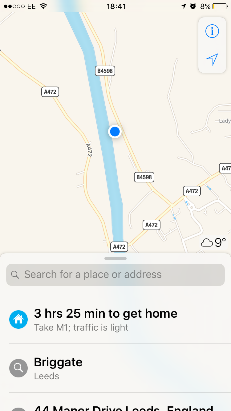
After extensive research on apps and mobile interfaces, I noticed that interactive elements were often placed at the bottom of the screen to minimise how far the finger needs to travel to touch it. Despite this, I noticed that important information and icons within apps (such as the home button on Facebook and Instagram) are often placed at the top of the screen making them easier to view for the user. These are things I must consider whilst designing my own app.


The size of icons/buttons within an app must also be considered. Icons must be big enough to see and touch yet should not overcrowd the interface. When including these interactive elements within my design I will look at the sizes other apps and competitors use for inspiration.

No comments:
Post a Comment