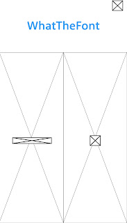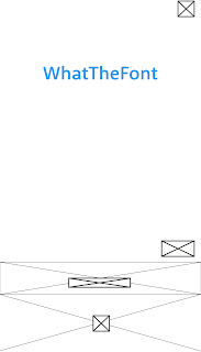

I sketched a number of different home screen options (seen above). Each focuses on the ease of use for the user. A simple slide up/down on the first idea and left/right on the second means the user can access the camera and camera roll straight after opening the app meaning fonts can be checked in seconds. These would be clearly separated using different colours making them easily distinguishable.
I created a number of options for a navigation bar which helps the user move around the app with ease (below). The option of the left drops down from the top left of the screen and is easily hidden so users can see more of the screen. The example on the right drops down from the top of the screen and is very similar to example of navigation bars within research.
The interfaces below were created for users to select photos already on their camera roll. The simple layout in clean and easy to use making selecting photos a quick process.


When an image is selected it can be cropped to help the app find the correct letterforms. The simple layout to do this can be seen below. Limited icons and large amounts of white space helps the user easily move through each stage of the font finding process.
When a user decides to capture type straight out of the app, the image will be scanned so each letterform can be detected. The previous interface for this on the What the Font app is dated and difficult to fill out. My new design focuses on each letterform per screen making it easier to understand.
The final stage in this apps design gives the user a number of options for which typeface it could be as the app is often inaccurate. I wanted this to stay simple but let the user easily look at the type in use.
_____________________________________________________________________________
As I wanted to develop the Monotype app more than the first idea, my wireframes were more detailed and I went into depth within my notes.


No comments:
Post a Comment