A unique typeface is used throughout which is recognisable as the barbers own. This also helps successfully link all collateral together.
The design team for a barbers named Monthly have based the brief around the name. Collateral is used to link better to this concept such as an annual magazine with articles on the hairdressers and different hair styles. Business cards also number the days of the month on the reverse meaning appointments are easily written down for customers whilst also linking clearly to the identity.
Using a common colour throughout the identity of this hair salon, the design team has linked all work together well. Illustrative posters add a unique aspect to the brief.
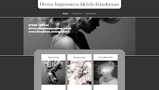
I found that the majority of mobile businesses had unattractive branding that wouldn't work particularly well for their target audience. Some examples can be seen below.
Black and grey were commonly used to portray the company as being luxurious however the type choice was often not appropriate making the businesses seem less professional than they would hope to be.


No comments:
Post a Comment