Together we started to experiment with a number of contempary typefaces to be used within the logo and as body text across other parts f the branding. We focussed more on fonts with recognisable 'quirks' making the logo both visibly pleasing and identifiable when seen around by our intended audience.
Idea Development
Experimentation with different typefaces and typesetteing gave us a better idea on how we can focus the identity on what WYS is and what it represents.
We compared various sans serif typefaces we felt best worked for the simple, contempary look we had chosen to represent who we are. The final chosen typeface within the logo was Primera from Noo Type which "features wide area with a futuristic and aspect which is accentuated by its horizontal strokes. We also decided to use Dromo for body copy as it is easier to read than Primera yet they also work well together.
Idea Concept
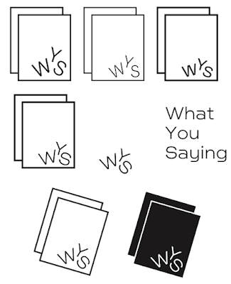
We decided to include two rectangles around the WYS as related to our love of print and focus on editorial design.
The WYS logotype would looks like it has fallen to the position they're in resembling the ambiguous design ideas we hope to ring into the publishing industry. This was pushed even further by slightly rotating the 'paper-like' rectangles around the text. The rotation concept and experimental way the WS letters are placed on the page is an idea we wanted to extend throughout the identity.
Final Logo
So the logo would be versatile across various platforms and mean we are not limited to a certain kind of work it was decided to use a black and white colour scheme and simplistic design across the branding.
The logo we have created will help us to be recognised within the publishing world and help us to stand out against the other independent publishing houses (such as those identified in previous research).
The logo can e used in various was across the different media we produce. The logo with rectangles can be used for the publishing side to WYS and the logo type can be used for different aspects of the brand.
An important stage after this will be to purchase the typefaces used within the branding so not to infringe copyright.


No comments:
Post a Comment