


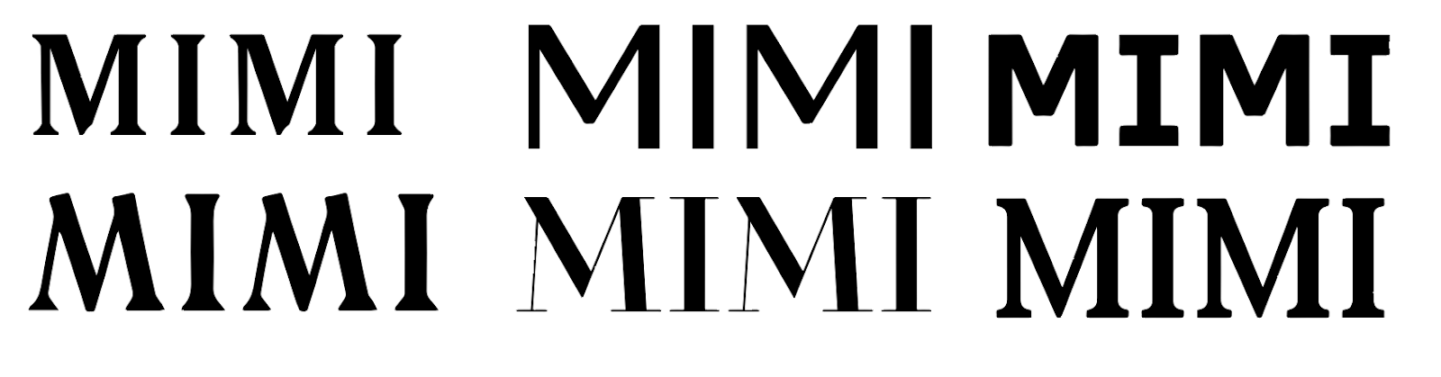
After experimenting with using the typeface Solanel within the business card, I decided that a logo type may be most suitable for Mimi. I experimented with a number of contempary typefaces, looking at both serif and sans serif as well as various weights.
I also experimented with using colour, first using black and grey however this conveyed more of a luxury brand. I then used a pale blue which, when paired with the chosen typeface, had a more feminine look. This worked well to portray who Mimi is and so I decided this would be shown for feedback from my next critique.


I started to look at how I could also bring Mimi's branding into a portfolio publication which would then be used by my client to give to potential employers. To show the portfolio I first had the idea to portray it as a newspaper as they often use heavily gridded stems, linking well to the identity idea.

Once the typeface Morion had been chosen, I experimented with how the portfolio's cover would look. Firstly I looked at using the bio given to me so readers could have a first impression of the work within however after development I decided to use a more clean cut front cover design which invites the reader in without giving too much away. This also means the reader opinion of Mimi is left until the images are seen inside the publication.


I idea seen below uses die cut holes in the editorial, running throughout to show each project on each page.


The chosen colour scheme was applied to the ideas and experimented with further:


As one of the deliverables for this brief was to produce a website, I started sketching ideas once the different elements within the design were chosen.
1. The first idea will have separate pages showing projects, info and landing page which would each use the same blue grid seen on the business cards and portfolio.

2. This idea is very simple and includes all the content on one page. The images Mimi has given me will go through a constant slideshow. The text will be visible when opening the side and can be removed or added when the mouse hovers the first icon in the top right. The other two icons are used to contact her via email and open her social media in a separate tab.

I will bring the development I have done to the project to the next critique for feedback on how I should continue.
No comments:
Post a Comment