Producing the site on Adobe muse was time consuming as each page must must be consistently perfect
After speaking to Ben, we decided that a eye catching landing page should be added to the site which would be visible every time it is opened up by a user. To help this stand out, I produced a typographical gif to draw in the audience.


I decided that this page would only be available when opening the site and wouldn't be accessible once on of the links to further in the site have been pressed. I also felt the menu used across the rest of the site wasn't appropriate for the landing page. Because of this I designed a menu exclusively for this landing page.

Receiving feedback on typography from the most recent critique lead Ben & I to consider how it would be used throughout the WYS identity. It was decided that all text using Primera, such as headings, would be in uppercase as this is how it is used within the logo. Because of this, it must be translated into the Website design. Other changes in design and layout were also added during the website development. This can be seen below:

As advised within the last critique, the type only logo was included across the site. This is also cleaner and looks better on the page. It was also decreased in size, again giving more space.

The photos on artist pages scroll whilst text is static, this means the viewer can read through information whilst also looking at what each artist has to offer. All other pages can be accessed wherever the viewer is on the site.

Although in the future we hope to put on a launch, exhibitions and events; for now we have no dates solidified. Despite this, we wanted an events page to be included so our audience are aware of what's to come. For this I created another gif making the page more interesting.

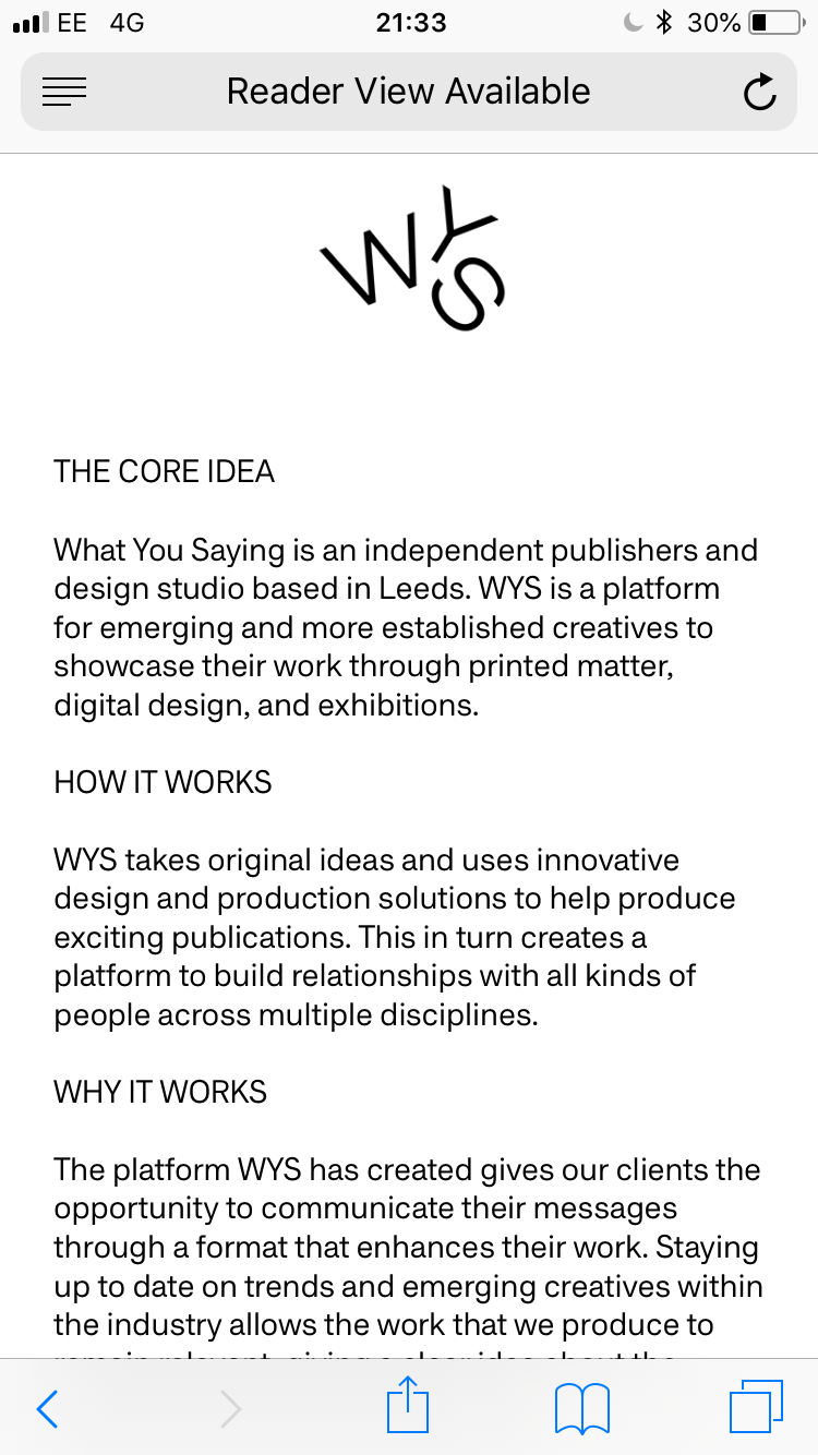
Previously we had planned to collaborate with the Mannequin Collective on a video to be used for promotion and the info page. Despite this, we decided that this was something we would do over summer as we were restricted with time and felt it wouldn't be given our full attention at this moment in time. Because of this, we split the info page into three sections in the hope this would best help to explain what WYS is. These were: The core idea, how it works and why it works.

As a lot of our younger target audience will find out about WYS through social media such as instagram, most of the site traffic will come from mobile users. Because of this, the mobile site must work as well as the desktop version of the site. I tried to make this as similar to the desktop version as I could so it was easy to see they were the same site. Despite this, it was difficult to keep everything the same when working to a much smaller screen.
I decided that the menu would be accessible by touching the logo where it would then drop down onto the content. This means it can still be accessed anywhere on the site.

Unfortunately Muse doesn't allow me to keep the logo and menu at the top of the screen when scrolling. Because of this, the user must scroll back to the top t visit other pages on the site. Despite this, the site is still easy to use and is in keeping with the WYS aesthetic.


The events and info pages stayed virtually the same, using the same text and gifs also used on the desktop version of the site.

No comments:
Post a Comment