I want the name of this zine to be short and punchy so my target audience is instantly attracted to it. I looked at variations ranging from obvious to more unique and ambiguous. My ideas are below:
Punk!
Faces of Punk
knup
spike
in your face
anarchy
70's rebellion
rebel
rejecting hierarchy
I decided to use "Punk" as the title as it's simple and will be the best way to show my audience what's inside.
After deciding on a title for my zine, I started to look into typefaces I can use on the cover and as body copy within the front cover, explaining the contents. For the cover, I decided the typeface must be relevant to punk culture yet be contempary similar to the layout of my book. Because of this, I experimented with bold, modern typefaces and handwritten type. These experiments are seen below:
As this brief is being produced in conjunction to WYS, I want there to be some consistencies between the two. Because of this, I have decided to use the typeface Dromo book to use for body copy within the zine, despite this only being 3-4 lines, it will work well to link the projects together. I wanted this short passage of text to best explain the contents of the zine. The introduction I decided to use was: "A documentation of punk culture through related imagery".
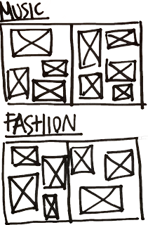
I produced sketched ideas of how I could produce each layout. I did this by looking at the photos I had collected and imagining which would be selected and where they could be placed.

The sketches and previous research on photo books and zines heavily inspired the early layouts created for this project. These designs were done on indesign and produced to a strict grid system. Although the layout is based on the experimental punk zines of the 1970's, I decided to stick to the grid system to show the zine's link to contemporary design. Despite this, the placement of images will still resemble those looked at in research.
Earlier in the brief I noted how each spread of the final zine would be focussed on a different aspects of punk culture. I have already collected images for each of the spread titles so I must choose which are most appropriate for each page. I will do this by choosing the images that I believe are suitable for my target audience and stand out the most.


No comments:
Post a Comment