My last critique helped me to decide how my developed idea would look across the whole identity. I was able to constrain m ideas into what is seen below.
I experimented with how the business card could be laid out, again looking at various grids however kept the logo central and colour scheme and typeface the same.

The back of the card follows the same grid system however this is symbolised using crosses with the text placed within these. The same typeface is used for body copy as it is versatile and works well in most situations.

As suggested in my last critique, my clients portfolio will be presented within a card sleeve with her photographs printed on single sheets of paper and placed inside. After experimenting with the design previously, I came up with an outcome that work well alongside the rest of Mimi's branding.


After sketching the website ideas out and choosing to progress with the more simple idea within the critique, I started to produce this on Adobe Muse. As I am now confident in this program, having produced a website for multiple briefs, I found this quick and easy to do. Using GoDaddy I set up Mimi's website to go live an created a business email for her to use that would link to her domain and depict a more professional photographer. The website can be accessed here.


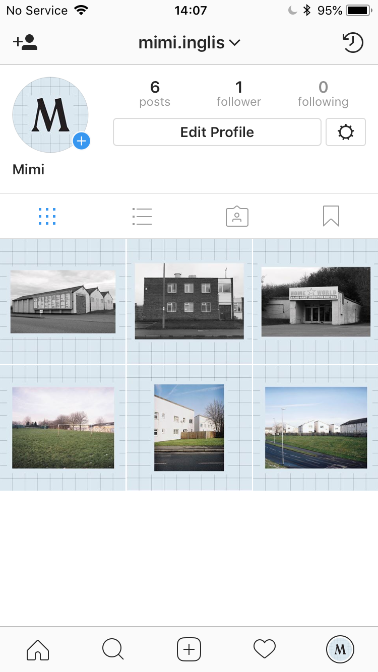
Whilst the development of the website was taking place, I started to think about social media and how the concept could be translated into a larger internet presence. As the website is so simple, acting as a quick way to contact my client, I decided the Instagram would be used to give more information about selected projects and photographs. I produced a grid for both portrait and landscape photos which Mimi could easily add photos to for posting. I also took the M from the logo type to use as the profile image.


No comments:
Post a Comment