Ben and I decided that the site would be hosted using GoDaddy. This means the domain can be bought and the site can be easily posted and updated using Muse. We decided to use the domain w-y-s.co.uk as it is memorable and differs from other competitors. It also enables us to disclose exactly who we are, giving us the opportunity to sell or move the studio in any direction we like.
Using GoDaddy to set up a WYS email will inevitably help us look more professional when contacting clients. It will legitimise the business and enable customers buying products from the site to email a help email rather than our personal ones.
Before the official launch when the site is publicised, we tested it amongst peers on the course. Both the mobile and desktop sites were given to 3 people and we asked questions for feedback. These were:
Is the site navigable and easy to use?
Overall those testing were able to use the site with ease. As the mobile site starts with the landing page, it became clear that the logo must be pressed to see the drop down menu however they noted that it would be difficult on one of the other pages.
Is the site interesting and informative?
When the site was given to the peers, they looked through each page. It was important they found it interesting as are part of our creative target audience.
is there anything you would improve?
Our peers noted they liked the overall aesthetic of the website and found it worked fluidly. However, as we expected there to be, there were a number of issues such as text off the page and other minor issue. These were, however easy to solve. This is the
Saturday, 12 May 2018
OUGD603 - WYS - Store
I did some research into hosting a store off Muse however I found that it is difficult to set up and can often be less secure. Having used Bigcartel before, I decided this would be most appropriate for the site. This way the store is customisable and the domain can be an extension of the main site. I laid out each of the potential products on a black background. This worked well to blend into the black page of the store
OUGD603 - WYS - Adobe Muse
As I have past experience with muse and know that it can be optimised for this deliverable, it was decided that it would be used to produce the WYS site. My previous research and experiments on XD influenced the progression on the site however it was developed further on Muse.
Producing the site on Adobe muse was time consuming as each page must must be consistently perfect
After speaking to Ben, we decided that a eye catching landing page should be added to the site which would be visible every time it is opened up by a user. To help this stand out, I produced a typographical gif to draw in the audience.
The gif was also reproduced for mobile viewing.
I decided that this page would only be available when opening the site and wouldn't be accessible once on of the links to further in the site have been pressed. I also felt the menu used across the rest of the site wasn't appropriate for the landing page. Because of this I designed a menu exclusively for this landing page.
Producing the site on Adobe muse was time consuming as each page must must be consistently perfect
After speaking to Ben, we decided that a eye catching landing page should be added to the site which would be visible every time it is opened up by a user. To help this stand out, I produced a typographical gif to draw in the audience.
The gif was also reproduced for mobile viewing.
I decided that this page would only be available when opening the site and wouldn't be accessible once on of the links to further in the site have been pressed. I also felt the menu used across the rest of the site wasn't appropriate for the landing page. Because of this I designed a menu exclusively for this landing page.
Receiving feedback on typography from the most recent critique lead Ben & I to consider how it would be used throughout the WYS identity. It was decided that all text using Primera, such as headings, would be in uppercase as this is how it is used within the logo. Because of this, it must be translated into the Website design. Other changes in design and layout were also added during the website development. This can be seen below:
As advised within the last critique, the type only logo was included across the site. This is also cleaner and looks better on the page. It was also decreased in size, again giving more space.
The photos on artist pages scroll whilst text is static, this means the viewer can read through information whilst also looking at what each artist has to offer. All other pages can be accessed wherever the viewer is on the site.
Although in the future we hope to put on a launch, exhibitions and events; for now we have no dates solidified. Despite this, we wanted an events page to be included so our audience are aware of what's to come. For this I created another gif making the page more interesting.
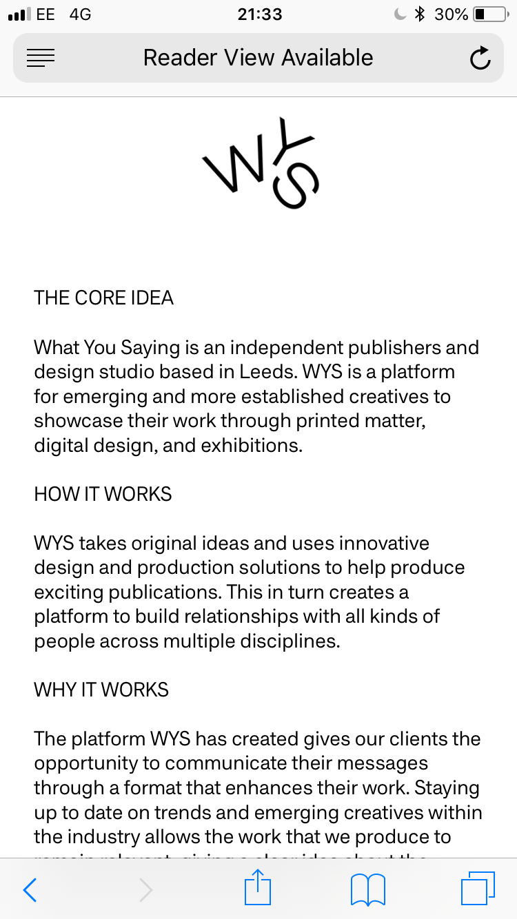
Previously we had planned to collaborate with the Mannequin Collective on a video to be used for promotion and the info page. Despite this, we decided that this was something we would do over summer as we were restricted with time and felt it wouldn't be given our full attention at this moment in time. Because of this, we split the info page into three sections in the hope this would best help to explain what WYS is. These were: The core idea, how it works and why it works.
As a lot of our younger target audience will find out about WYS through social media such as instagram, most of the site traffic will come from mobile users. Because of this, the mobile site must work as well as the desktop version of the site. I tried to make this as similar to the desktop version as I could so it was easy to see they were the same site. Despite this, it was difficult to keep everything the same when working to a much smaller screen.
I decided that the menu would be accessible by touching the logo where it would then drop down onto the content. This means it can still be accessed anywhere on the site.
Unfortunately Muse doesn't allow me to keep the logo and menu at the top of the screen when scrolling. Because of this, the user must scroll back to the top t visit other pages on the site. Despite this, the site is still easy to use and is in keeping with the WYS aesthetic.
The events and info pages stayed virtually the same, using the same text and gifs also used on the desktop version of the site.
OUGD603 - WYS - Promo pack
One of the deliverables for this brief is the promo pack which will be sent out to potential clients, peers who we want to know about WYS and also be sold on the website. This part of the brief was given to Ben to produce however, I would give input throughout helping develop different parts of the process. This is the same as how Ben will help me produce the website.
The main idea behind postcards was to give a short introduction about WYS and inform our audience about how they can find out more. These also work well as the can be updated with ease meaning more can be produced as we work with more artists.
Business cards
These are one of the most essential deliverables for this brief as are the best way to give information about myself and WYS whilst networking in industry. It was important that the business cards stand out as the are often collected and never looked at again. If they are unique, the audience are more likely to contact us.
The WYS aesthetic had already been chosen when it came to producing the business cards. We decided that a black and white colour scheme would be continue, Primera an Dromo would also be used for text and the overall design would be simple.
Ben and I felt it was important to have a business card at the standard size as not to overcomplicate the design.
OUGD603 - WYS - Critique
Ben and I sat down with a small critique for feedback on the WYS website, this would in turn help to progress with the overall design of the site when it is brought into adobe muse. Feedback from this critique showed that the site was easy to use and clear what the aim is. Feedback suggested using the logo without the boxes as this was not printed material and helped the site look more clean. The liked the idea that on some pages only half the page would scroll and that each page was accessible from anywhere on the site.
The suggested the menu was either kept one colour or was just always black as it didn't fit well with the WYS identity. The crit group also said the type used should be considered further. Although Primera and Dromo have been selected for headings and body text respectively, this will be looked into further so the chosen text is optimised for the website.
This critique has been useful to better understand our audience's preferences when it comes to viewing content online. The feedback we have received will be taken into account when designing the site on Muse.
OUGD603 - WYS - T-shirts
Merchandise was identified within the brief as being an important part of the branding as can be used for promotion and to sell to our audience for extra profit. This part of the process also meant we could try out new techniques that we were less familiar with such as screen printing and heat press.
We decided the t-shirts should be simple and include our logo and designs produced earlier in the brief. The first design uses the logo without boxes, this is used for deliverables of WYS that don't involve print. The second design is more comical and relates to a trend amongst younger people where the hand sign is produced to trick a friend, therefore linking well to our target audience. This was animated for instagram content however, it was decided that it would also work well on a shirt.
Mockups were created for the designs, first to show how the would be produced but also as a means to promote the products on a store and Instagram in the future. We chose to print on Gildan t-shirts as the are good quality and can be bought for cheap off Amazon. This means the can be sold for a higher profit margin. If there is a higher demand for the t-shirts we will look to out source the printing however for now, this can be done using the facilities available to us at university.
We decided the t-shirts should be simple and include our logo and designs produced earlier in the brief. The first design uses the logo without boxes, this is used for deliverables of WYS that don't involve print. The second design is more comical and relates to a trend amongst younger people where the hand sign is produced to trick a friend, therefore linking well to our target audience. This was animated for instagram content however, it was decided that it would also work well on a shirt.
Mockups were created for the designs, first to show how the would be produced but also as a means to promote the products on a store and Instagram in the future. We chose to print on Gildan t-shirts as the are good quality and can be bought for cheap off Amazon. This means the can be sold for a higher profit margin. If there is a higher demand for the t-shirts we will look to out source the printing however for now, this can be done using the facilities available to us at university.
Below shows the original t-shirt printing we did. Unfortunately, we found out that the print can bleed if the ink is pulled through too many times. This experimentation was vital for us as has shown how the mistakes we have made can be avoided in the future.
I had the idea to experiment with the designs further, showing Ben how the logo could be repeated on the back of the shirt. I used tape to create a rectangle border, as there was ink on the screen from previous prints, we made sure this wasn't cleaned and so left an interesting all over print.
A grey shirt was also printed, we had the idea to have a line of exclusive t-shirts which would only be available for us and our friends, this could be done using different colour t-shirts however will be experimented with when more are ordered.
OUGD603 - WYS - Adobe XD
Once research was complete and the wireframes had been produced for WYS, Ben & I had a better idea what the overall of the design would look like. The wireframes were then brought onto Adobe Xd as this helps to visualise our ideas and change anything that may have worked in sketched form but doesn't work as well on screen. The initial prototypes are seen below.
A large box was shown in the centre of the page where a video explaining who we are and what we do would be placed. This would be the home page and would load as soon as the user opens the site. This interactive element means our audience won't need to read anything to learn about us, in the hope that the idea better sticks in the mind of the viewer.
The menu on the left is characterised by different colours helping to differentiate between each page. When active, the selected page is then indented, standing out further.
The store is simple and easy to use meaning there is no confusion if the audience is looking to buy something. Placeholder images were used to show how experimental the photos could be to help sell the products.
The contact link will enable the user to go straight to email in a separate tab, meaning it will be quick and simple to contact us.
After producing the first layout idea, experimentation was done with the placement of various elements on the page. The second development below shows how the menu could be placed on the top left, giving room for content to spread across the whole width of the spread.
The video below shows how the menu would drop down when clicked. The majority of each page stays the same however, this concept was shown to give each element of the page more breathing space.
This idea played on the website having further use as a marketing tool and enabled the user to see the books each artist has produced at the bottom of their corresponding pages.
The website went through constant development on Adobe XD, experimenting with the menu and logo placement as a worked through the site.
A large box was shown in the centre of the page where a video explaining who we are and what we do would be placed. This would be the home page and would load as soon as the user opens the site. This interactive element means our audience won't need to read anything to learn about us, in the hope that the idea better sticks in the mind of the viewer.
The menu on the left is characterised by different colours helping to differentiate between each page. When active, the selected page is then indented, standing out further.
The artists page is laid out in a simple collage like way and shows how the page will be able to scroll through content on the right but the menu and logo would be static on the left.
The contact link will enable the user to go straight to email in a separate tab, meaning it will be quick and simple to contact us.
After producing the first layout idea, experimentation was done with the placement of various elements on the page. The second development below shows how the menu could be placed on the top left, giving room for content to spread across the whole width of the spread.
The video below shows how the menu would drop down when clicked. The majority of each page stays the same however, this concept was shown to give each element of the page more breathing space.
The website went through constant development on Adobe XD, experimenting with the menu and logo placement as a worked through the site.
After going through various developments on Adobe XD, a final layout was chosen to use for the website before it was brought onto Adobe Muse for further development. This concept took ideas from both the previous layouts seen above, placing the menu and logo on the left side but reducing the size, giving more room to each element on the page.
After these website developments, the next stage will be to bring the idea to a critique for further feedback before it is developed further on Adobe Muse.
Subscribe to:
Posts (Atom)