This module has significantly improved my overall development as a designer. I have changed my design process and overall style considerably which in turn has meant I am more excited for the future than I was previously. I believe this progression into a more experienced and professional designer has been solely down too WYS.
As WYS has been such an important and well developed brief, I was unfortunately only able to to produce six out my eight intended briefs. Although these briefs changed as the year progressed, the most substantial were produced for the module. I would still like to complete the briefs I was not able to do this ear as I was looking forward to doing them. This includes producing a football programme in the style of 1970's programmes, showing how design is still relevant and books that will be produced within WYS for a number of photographers.
Previously I had identified an interest in editorial design as it enabled me to work within photography and fashion. When this progressed into WYS at the start of the year, I started to look further into the medium and how it could influence my practice further.
Researching into independent publishing and those producing work for the market has introduced more contemporary graphic design into my practice. After taking inspiration from such designs and applying it in my own unique wa to the briefs within the module, I have slowly developed a style that I am comfortable using and pushing to the limit. This has only become clear towards the of the module whilst reflecting, however more appropriate typography and colour choice has helped me move towards this.
Whilst reflecting, I have noticed some similarities between briefs. The one that stands out is collaboration. This year I have found this easier as I have become more familiar with working with Ben and other creatives on and off the course. This will be an important part of my future with WYS so my practice with this throughout the module will help to improve my practice in the future.
I have also noticed how many live briefs I have done as part of my extended practice. Live briefs have given me the opportunity to work with clients face to face as I would if I was freelance. These briefs have been some of my most successful as I feel I have worked efficiently to the clients needs whilst also producing work that suits my style and that I am happy with. Such briefs include the year book, Casper Tape and Mimi identity. I will take what I have learnt this past year when it comes to working for a client into my professionally role as a graphic design after graduation.
Sunday, 13 May 2018
OUGD603 - Year Book - Evaluation
This brief has been one of the most worthwhile of them all because of the opportunities it has given. This is the first substantial live brief that WYS has produced collaboratively, meaning there was a large budget to work with and more considerations to adhere to. Fortunately, Ben and I found that we worked well together to produce final outcomes that were appropriate for the brief. This was essential as we could bounce ideas off each other, eventually producing a successful outcome.
Although we originally had hoped to produce the graphic design year book, losing this original competition has worked in our favour. After picking up the photography brief, we were able to develop and adapt our existing ideas so they worked more appropriately for the new clients. This also meant we had the opportunity to work with a new group of people, which meant we could re-establish our role as professional graphic designers.
Because the brief had turned to photography, we had the opportunity to experiment with layout, production methods and concept even further. This development helped to produce a book that fit the requirements of the brief but was also unique and eye-catching.
Although the majority of the brief went to plan, there were obvious downfalls. Although we had proceeded with the photography brief, it is a shame that we weren’t successful in graphic design. This has shown that presentations must be clear and concise and that we must be fully prepared before presenting the client with work.
Because we had to wait for photography students to hand in their work, much of the design process sped up towards the end of the brief. Fortunately, due to a well planned out brief, we knew exactly what needed to be produced at different times so this was less of an inconvenience than we first thought it would be.
OUGD603 - Year Book - Final Draft
Final updates to the photography year book derived from the feedback Orlando gave us. This included re-structuring the contents page into a more simple layout. It would now be shown in two columns withe the student's name at one side of the page and their corresponding number at the other. This became more legible and keeps within the grid system first designed at the start of the brief.

The page numbers were now set in the bottom right of the page, outside of the gridded content and in 20pt. This helped to better show the flip book idea however it was difficult to give different elements enough space with it here so experimentation was needed to get it perfect.


The information page was set to white, keeping it consistent with the rest of the book. When experimenting with text, we found it would be difficult adding each student's information as some had written a considerable amount. Because of this, we asked them to reduce it down to 200-300 characters which would inevitably take up less room.

When this final draft was shown to the client, we received positive feedback. Unfortunately the full book couldn't be produced before our hand in as not ever student had submitted their work and it wouldn't yet be going to print. Despite this, it was decided that this draft would be the preliminary final outcome as the photography students felt it worked well. It will then be updated and go to print after hand in.
OUGD603 - Year Book - Designing photography year book
As this book is so long and the time frame is only short Ben and I decided to start designing. We first produced a grid system that we would stick to throughout the publication. Consistency in layout is essential throughout the book so we determined that we would be strict with how images interact with this grid system.

Once the text on each page was determined, Ben started adding images to the page, however this would be changed substantially later in the design process. This was because we later decided that each page would be designed specifically to the images on the page rather than them follow a pattern as the 49 degree concept focuses on how important each individual person on the course is.


After Ben added each of the images to their respected pages I sat down with him and gave my opinion on each page. This included where images should go in relation to the grid and other images on the page, where the photographer names and projects should go and the use of page numbers. This part of the process became more of a collaborative part of the design process as Ben and I sat down and designed it together. This led to a more successful design outcome as we were both able to input our different ideas. Repeatedly going over the layout as we did gives us a fresh mind each time we go back to the top. This means we are able to spot any imperfections and change them with ease. Whilst doing this we were conscious that each of the pages work next to each other. One example of this was varying where full bleed images were in the book.


After producing this draft we decided on changes such as putting the book in alphabetical order by last name. This is how you should order names and felt it would be more appropriate for the book as it is also how their register is ordered. We were also able to refine the layout further as a fresh look at the pages gave us the opportunity to almost start again. The contents page I designed for the Graphic design year book was kept as shows each name in a more unique and interesting way. The equal spacing between each text signifies the consistencies in grid and design within the year book and also relates to how each student is equal. Other improvements included adding information about each project at the back of the editorial. Although it meant the reader would be flicking from the front to the back of the book, the layout became more focussed around the photos linking to our initial idea that it is designed more like a photo book to display everyone on the course's work.
This draft also led to changes in the page numbers. I felt that each student should be designated a page number. This would then be placed in one of the corners and set to their respected degree so the number looks like it's turning when used like a flip book. This was one of my ideas that Ben first disagreed with, however after feedback from peers and showing him how it would look we both decided this would be the best way to show the numbers.


After producing this layout we went to the tutor Orlando looking for feedback. This proved to be vital as we were able to get a completely new opinion on how it should both look and function. His feedback was predominantly positive and ideas for changes were often minute. This included showing the photographer's project title in Title Case on each page rather than uppercase as some titles may be more obscure (e.g. unTitleD). It would also contrast well to the uppercase name on the opposite page.
Orlando also felt the content page should be changed as the concept wasn't clear and he didn't personally think it looked as good as we had originally thought. He lastly felt the contact and information page should be on white not black as it was inconsistent with the other layouts in the publication. This feedback was taken on board and applied to to next, final draft.
Saturday, 12 May 2018
OUGD603 - WYS - Evaluation
Out of all the completed briefs, WYS has been the main priority and the most substantial. Four months were spent developing and producing all the outcomes for this brief as we have plans to pursue WYS after university. This long period of time was essential for us to be able to develop and refine each deliverable so it best portrayed us as designers and WYS as a studio. The long brief also enabled us to think properly about what WYS is and what are goals are. In turn, this has meant we haven't held back in exploring different possibilities and avenues the studio could take us. Spending this much on the brief has also meant Ben and I have learnt how to work together efficiently and better understand each others strengths and weaknesses.
In the early stages, we identified competitors and people we would like to contact through research. The research has proved to be an important part of the process, showing people such as Kiosk Books, Catalogue, Actual Source among other influencers. Deliverables such as the promo pack will be used to contact these sort of people in the hope we can collaborate, work for them or just get in touch
By the end of the brief I had become a more proficient designer, producing work consistently to time plans and using research as an important tool in the design process. Focussing on WYS this year has led me to speak to more peers about the publishing industry and get get my foot in the door with influential designers and creatives. his was mainly down to how I have taken advantage of what Uni has to offer. With most guest lectures, Ben and I asked for feedback and opinions on WYS which in turn helped us to think about aspects that weren't previously considered. We have also attended the start up Tuesdays and Wednesdays which are short business courses run by uni. These have helped us better understand how to act when in a business and what we should consider.
Other advantages taken from uni include the facilities. This includes both the digital and traditional print rooms which have helped us produce most of the deliverables for the brief. Without these we would have had to out source the printing and relied on other people to produce our outcomes at the standard we are hoping for. This includes screen printing t-shirts, a technique I had not previously experimented with. After doing this at uni, I am more confident that it is something I will also produce in the future.
Other skills have been learnt whilst producing outcomes for this brief. One of the most important for our development was risograph. Learning about this unique technique has helped inspire projects we hope to produce after we graduate such as a series of zines. Using the photocopier within the research brief, which was also linked to this brief, has also shown us what is possible in publishing and has helped us set our sights high for the future.
As previously mentioned, the research brief within this module was linked to WYS, as were other briefs such as the year book. Bringing WYS into other briefs has helped us to develop more skills that are related to the studio. It has also meant we could develop the idea further whilst also producing other briefs.
Unfortunately there were some parts of the brief that could have gone better such as taking advantage of our social media. With Instagram now being such a large platform, we felt this should be used to our advantage to build our audience. Unfortunately, due to time spent on other briefs, we were unable to consistently follow, post and like on our Instagram. This is however something he hope to do in the future as can be the best wa to get the WYS brand well known.
We also didn't achieve all he had planned for this year. At the start of the brief we had hoped we would have had our launch party, which would invite creatives from around the country to a night for WYS. This is, however something we plan to do in the near future. We also hoped to have more items for sale on the site but because of time constraints not letting us produce enough to sell,m this will have to wait until later in the year.
OUGD603 - WYS - Site launch
To launch the site we took advantage of the progress we had done on the WYS social media as well as our own accounts. We publicised the launch using animated posts, created in collaboration with Sam Hughes. These were also added to our own Instagram stories which in turn caused people to visit the site.


To see how many people interacted with our site and Instagram, I set up Google Analytics and Instagram Business accounts. These features enable me to track how many people are on the site and Instagram, where they are from and what pages/ posts they interacted with the most.

The pie and bar charts above show statistics about who visits our Instagram page. This is useful and comforting information as our target audience (mainly 18-24 year olds) visit the page the most.


On the night of the website launch it was recorded that _____ viewed the site. This showed that people responded well to our marketing on social media. This shows that it must be kept up if we are to have a returning audience.

OUGD602 - WYS - Stickers
Stickers can be an important part of marketing as our audience may stick them, similar to guerrilla advertising in public anywhere in the world. To get them to our audience they will be included within products bought on the site, promo pack and sold on the site. They can be made easily at uni in the print room and bought online for cheap making them expendable and can be given out to anyone.
We decided the stickers would be simple and kept to a 70mm x 70mm size. There are 5 variations of the WYS logo on the stickers as some are in black and some in white.


OUGD603 - WYS - setting up site for launch and testing
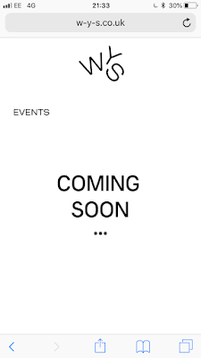
Ben and I decided that the site would be hosted using GoDaddy. This means the domain can be bought and the site can be easily posted and updated using Muse. We decided to use the domain w-y-s.co.uk as it is memorable and differs from other competitors. It also enables us to disclose exactly who we are, giving us the opportunity to sell or move the studio in any direction we like.
Using GoDaddy to set up a WYS email will inevitably help us look more professional when contacting clients. It will legitimise the business and enable customers buying products from the site to email a help email rather than our personal ones.

Before the official launch when the site is publicised, we tested it amongst peers on the course. Both the mobile and desktop sites were given to 3 people and we asked questions for feedback. These were:
Is the site navigable and easy to use?
Overall those testing were able to use the site with ease. As the mobile site starts with the landing page, it became clear that the logo must be pressed to see the drop down menu however they noted that it would be difficult on one of the other pages.
Is the site interesting and informative?
When the site was given to the peers, they looked through each page. It was important they found it interesting as are part of our creative target audience.
is there anything you would improve?
Our peers noted they liked the overall aesthetic of the website and found it worked fluidly. However, as we expected there to be, there were a number of issues such as text off the page and other minor issue. These were, however easy to solve. This is the
OUGD603 - WYS - Store
I did some research into hosting a store off Muse however I found that it is difficult to set up and can often be less secure. Having used Bigcartel before, I decided this would be most appropriate for the site. This way the store is customisable and the domain can be an extension of the main site. I laid out each of the potential products on a black background. This worked well to blend into the black page of the store


OUGD603 - WYS - Adobe Muse
As I have past experience with muse and know that it can be optimised for this deliverable, it was decided that it would be used to produce the WYS site. My previous research and experiments on XD influenced the progression on the site however it was developed further on Muse.
Producing the site on Adobe muse was time consuming as each page must must be consistently perfect
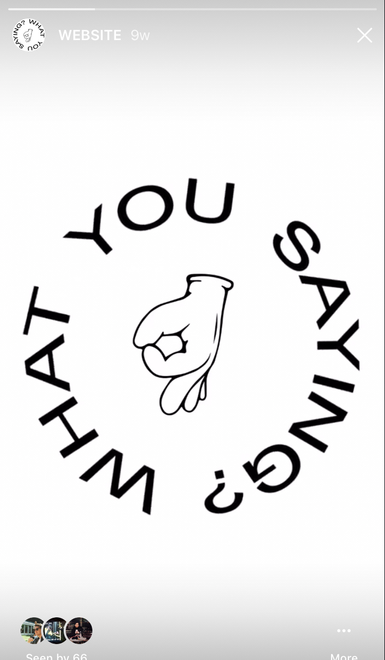
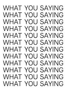
After speaking to Ben, we decided that a eye catching landing page should be added to the site which would be visible every time it is opened up by a user. To help this stand out, I produced a typographical gif to draw in the audience.
 The gif was also reproduced for mobile viewing.
I decided that this page would only be available when opening the site and wouldn't be accessible once on of the links to further in the site have been pressed. I also felt the menu used across the rest of the site wasn't appropriate for the landing page. Because of this I designed a menu exclusively for this landing page.


Producing the site on Adobe muse was time consuming as each page must must be consistently perfect
After speaking to Ben, we decided that a eye catching landing page should be added to the site which would be visible every time it is opened up by a user. To help this stand out, I produced a typographical gif to draw in the audience.


I decided that this page would only be available when opening the site and wouldn't be accessible once on of the links to further in the site have been pressed. I also felt the menu used across the rest of the site wasn't appropriate for the landing page. Because of this I designed a menu exclusively for this landing page.

Receiving feedback on typography from the most recent critique lead Ben & I to consider how it would be used throughout the WYS identity. It was decided that all text using Primera, such as headings, would be in uppercase as this is how it is used within the logo. Because of this, it must be translated into the Website design. Other changes in design and layout were also added during the website development. This can be seen below:

As advised within the last critique, the type only logo was included across the site. This is also cleaner and looks better on the page. It was also decreased in size, again giving more space.

The photos on artist pages scroll whilst text is static, this means the viewer can read through information whilst also looking at what each artist has to offer. All other pages can be accessed wherever the viewer is on the site.

Although in the future we hope to put on a launch, exhibitions and events; for now we have no dates solidified. Despite this, we wanted an events page to be included so our audience are aware of what's to come. For this I created another gif making the page more interesting.

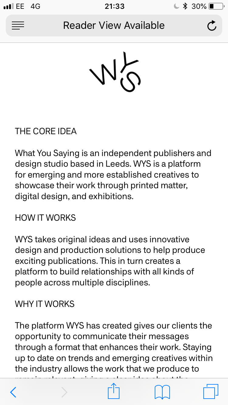
Previously we had planned to collaborate with the Mannequin Collective on a video to be used for promotion and the info page. Despite this, we decided that this was something we would do over summer as we were restricted with time and felt it wouldn't be given our full attention at this moment in time. Because of this, we split the info page into three sections in the hope this would best help to explain what WYS is. These were: The core idea, how it works and why it works.

As a lot of our younger target audience will find out about WYS through social media such as instagram, most of the site traffic will come from mobile users. Because of this, the mobile site must work as well as the desktop version of the site. I tried to make this as similar to the desktop version as I could so it was easy to see they were the same site. Despite this, it was difficult to keep everything the same when working to a much smaller screen.
I decided that the menu would be accessible by touching the logo where it would then drop down onto the content. This means it can still be accessed anywhere on the site.

Unfortunately Muse doesn't allow me to keep the logo and menu at the top of the screen when scrolling. Because of this, the user must scroll back to the top t visit other pages on the site. Despite this, the site is still easy to use and is in keeping with the WYS aesthetic.


The events and info pages stayed virtually the same, using the same text and gifs also used on the desktop version of the site.

Subscribe to:
Comments (Atom)