1
My first idea consisted of documenting the independent coffee shops of leeds, noting their location on my own map as well as my own personal rating of their coffee. I would hope for a more minimal design within this publication with strong photographs to accompany a design and layout that is successful for the brief.
2
Creating a book to show the best burgers in Leeds. With a large amount of restaurants to offer, with good photography and use of grid systems, I could create an informative guide to this topic.
3
My Final publication idea would comprise of information about recycling. This would link with the competition brief on sustainable design.Strong photography within the studio would work well with the information I give on my chosen topic to produce a book that, although usually seen as being a boring subject, can be reimagined as being a more aesthetically pleasing piece of work.
_____________________________________________________________________________
To help me decide my topic choice, I attended a critique with the second year BA Graphic Design Students. Once my brief and each idea had been explained to my peers I was open to feedback that could help with my development of the project. The opinions of those In my group showed my recycling publication was the most unique idea out of the three and would work well in conjunction with the brief.
The other students also noted a number of suggestions that could help my project progress further and become a better and more professional looking design. These ideas were as followed:
To look at creating the book out of recycled stock;
To think about my content and adding information such as statistics and what can and can't be recycled.
Use good photography that is eye catching and invites in the audience
These responses have been taken into considering as I decide on content for my book. I feel that in particular, the use of statistics together with added information and my photographs will be useful as could back any other ideas I wish to use in my book.
_____________________________________________________________________________
I first found some styles of publication that could work for my own project. One such example can be seen in an article on 'the women of wall street' in the magazine Vice. Vice use a simple two column grid system which is used throughout this part of the magazine. The images are large so the focus is aimed directly at them.


Interesting sections of text such as quotes are enlarged making them more eye catching. This encourages the audience to read the quotes and then continue reading the article. This is something I could use within my own brief as this subject is usually considered as being boring however enlarged, interesting pieces of text would draw the reader in as they flick through.


I also looked at some examples of design in the same subject area as me. On designspiration.com I found a number of pieces which worked especially well.


I want to create a publication that will inform my audience about recycling, reusing and up cycling. I will hopefully change their point of view and their actions in the future. I have decided that students should be my focused target audience.
After now living in student accommodation for six months I have noticed how students can be less aware of what can and can't be recycled as well as less care and attention when throwing away their rubbish. I hope to create an aesthetically pleasing publication that, because of its good design, will attract my chosen audience which will in turn inform them of this subject.
As this book intends to inform, I looked to creating a style how I present my book that would do this in an interesting way. I sketched a number of ideas on paper on how my publication could be set out with initial thoughts on the layout having an important role.
These ideas were then presented within another critique. This would focus of the style rather than content. I showed my group the range of concepts I had come up with and asked them a number of questions in reference to these ideas. I asked:
I want my publication to be unique, interesting and informative. Which themed idea do you think works best to show this?
Do you think a photography based book will attract my audience and be appropriate for this idea?
Should this publication be created as a well produced, one off artist book or be a small guide that can be printed cheaply and easily for my intended message to be spread efficiently?
My group thought I should experiment with both a hard copy, one off publication and a smaller, easily distributed book. These two ideas focus on different intentions for the book but both work well to portray my message.
They noted that I should consider being as sustainable as possible with support for the idea of using recycled paper. I noted, however that recycled paper is usually bad quality and can other be quite thin so they said to look at using different sheets of cut down scrap paper, handmade paper or textured paper. These ideas would still work with the sustainable theme but may produce a better outcome for my project.
With sustainability still in mind they said to look at different binding methods. Thinking about using methods away from staples as these cannot be recycled despite being a cheaper and quicker method of binding that other traditional techniques.
___________________________________________________________________________


Block colour pages with contrasting white and black type is eye catching and is clear and easy to read. This is something that could work well within my own publication. However, this example of block colour has been printed onto its stock. I would use coloured paper for this with white or black ink as would look for aesthetically pleasing for my final.

I want my book to show how man made objects take time to decompose into the earth whilst foods and dead plants take literally no time at all. One way I feel I could show this is through multiple photos of the same object taken at different times. This is similar to a time lapse however will work well within my publication.
I feel like I should experiment with different natural products as some may take longer than others to decompose. I will take photos of these experiments as may work well within my final piece. The items I will take photos of are as follows:

An apple core,
A banana skin and
Other fruits of veg
I am using the left overs from food as I know these will decompose the quickest. I will also photograph a man made product such as a plastic bag. Although it will say a different length of time has waited between photos, I will take these photos one after another with only small changes to the bags position as I know from research and knowledge that the plastic bag will take thousands of years to even decompose a little.
I created my own photography studio within my own room so I would be able to take these images.
The photos are seen below:


 _______________________________________________________________________________
I created my own photography studio within my own room so I would be able to take these images.


The photos are seen below:


It is important that my front cover is inviting to my particular audience and stands out among other informative publications. Because of this I want to use a unique design as well as colours that stand out and my chosen headings typeface.
The design I use must convey the ideas I sketched up as I and my critique found these to work best. This would show how everything can be re used or recycled which is the primary idea my book will convey.


The moving line that can be seen within my sketches could be used within my front cover and be used continuously as a theme throughout my book. It can be seen as being organic which works well within my recycling themes. I sketched some more using these ideas as felt would help develop my project and help me come up with the most successful cover possible.

___________________________________________________________________________
I have started to look at the typographical element of my design. I want to use two typefaces within my brief. I want the headings typeface to be unique and to stand out so I experimented with the word recycle.

The typeface I have decided to use is Narziss ProCy Ultrabold-Regular for headings due to its unique and modern qualities that work well with my chosen themes and ideas.
The body text I use must be legible so I will use a san serif typeface. The typeface I use must also work with my chosen headings typeface. Due to Narziss ProCy having thin parts within letterforms, I feel the same qualities would work for body text. Because of this, I feel I should use Garamond.

___________________________________________________________________________
The typeface I have decided to use is Narziss ProCy Ultrabold-Regular for headings due to its unique and modern qualities that work well with my chosen themes and ideas.
The body text I use must be legible so I will use a san serif typeface. The typeface I use must also work with my chosen headings typeface. Due to Narziss ProCy having thin parts within letterforms, I feel the same qualities would work for body text. Because of this, I feel I should use Garamond.

The type size I use is also very important as different pt sizes will be more appropriate than others for different things. I have decided to use 12pt for body text as this will should be legible at most publication printing sizes for my reader target audience.

Although my design works well I feel it needs to be contained within a space. Because of this I added a box around the image for further designs. As well as this I added my own personal logo as feel it is important that this book can be traced back to me so the audience can see other work of mine.
Now my front cover has been decided I want to explore different colour schemes on which to base this book. I explored obvious choices such as various greens which have obvious connotations to my recycling theme.


Although these work well to portray my ideas, I want my book to be unique and to stand out to my target market. Because of this I looked at using less conventional colours such as reds and blues. These experiments can be seen below.


I feel like the red colour scheme used works best as is dissimilar to the usual colours representing recycling. The bright, eye catching colour also gives off the ideas of danger and that this is an important subject matter meaning I am more likely to attract an audience for my publication.
___________________________________________________________________________
As information on this subject is usually seen as being boring I want to primarily use photography for my content. The text within my publication must also be clear and legible to cohere with these ideas as well as being short and to the point. I started to list the things I'd like to see within this book as well as what I thought would be most important and most useful for my audience.
I want to have different sections to my publication, similar to chapters. This will separate the different areas of the subject I would like to explore making it easier to read and understand my book. The areas I want to give information on are:
Recycling
Reusing and up cycling
A company/ design agency that are sustainable, think its important to recycle.
The future. What could happen etc.
I have already decided to include my rotten banana skin photos along with my plastic bag photos within my publication however I must look at other topics to touch on.
One thing I would like to show is what different products can be turned into as one of the things I have recognised as being important is informing my audience about what they could do to help save the planet. I feel like this is very important.
I have looked at including my own, small guide to up cycling as a page within my publication. I found different ways to up cycle for this, my photographic research can be seen below.


I feel like a simple up cycling process would work best for my book to show how easy it is to do. I would also like my guide to be suitable for my target audience. Because of this I want to show my audience how to create a simple plant pot, similar to my example within a welly above. I tried this first to see how successful it would be and found it worked well so I will continue to make more for my photographs.


Sustainable companies and recycling conscious design studios are something I wish to focus on. Because of this, I researched into these areas. One such company I found focuses on sustainable design is 19 Greek Street.
19 Greek Street
This London based design studio describes themselves as having a style which is eccentric, colourful and eclectic. They focus on disposable

Disposable Society
This exhibition by some students from Leeds College of Art shows off artwork featuring sustain ability. This could fit well into my design and will be considered for part of my books content.


King Koby
This shop is my barbers. I have noticed whilst getting my hair cut, their efficient use of up cycling. They reuse a number of items within their number of dee as fits well within their vintage aesthetic.



___________________________________________________________________________
I have decided to add a word to my front cover design. Adding 'use' beneath 'cycle' is not only an aesthetic choice to create a more fluent design but I feel it is important to be included within this cover for ideas relating to recycling. This can be seen below.

I have also had the idea to add a photo into my design. I am unsure whether this will be used within my final but I have shown within experimentation where my photos could be placed if I choose to do this. Adding photos onto my cover could add interest to my publication which would attract my target audience. I must be careful that the photograph used does not contradict my bright colour scheme but I will experiment with this further within my project once it is more developed.


The stock I use to print this design must replicate the ideas of sustainability. Because of this I have looked into different paper types I could use within this project.
The most obvious choice would be to use newsprint as this type of paper is created using recycled materials as was created for newspapers as cheap stock. There are various weights of this paper that could be used preventing the less rigid qualities of newspapers. Although this could work well, I feel like the colour of the stock could change the colours of my paper. Because of this I have explored other options for this brief.
I have recently discovered PaperBack which is a company that specialises in recycled paper. This will be perfect for my brief as I will be able to experiment with a number of stock choices. I have emailed this company noting my intended purpose for their paper, hoping that they will send me some samples to see which stock will work best.
 ________________________________________________________________________
I have decided to add a word to my front cover design. Adding 'use' beneath 'cycle' is not only an aesthetic choice to create a more fluent design but I feel it is important to be included within this cover for ideas relating to recycling. This can be seen below.

I have also had the idea to add a photo into my design. I am unsure whether this will be used within my final but I have shown within experimentation where my photos could be placed if I choose to do this. Adding photos onto my cover could add interest to my publication which would attract my target audience. I must be careful that the photograph used does not contradict my bright colour scheme but I will experiment with this further within my project once it is more developed.


___________________________________________________________________________
The most obvious choice would be to use newsprint as this type of paper is created using recycled materials as was created for newspapers as cheap stock. There are various weights of this paper that could be used preventing the less rigid qualities of newspapers. Although this could work well, I feel like the colour of the stock could change the colours of my paper. Because of this I have explored other options for this brief.
I have recently discovered PaperBack which is a company that specialises in recycled paper. This will be perfect for my brief as I will be able to experiment with a number of stock choices. I have emailed this company noting my intended purpose for their paper, hoping that they will send me some samples to see which stock will work best.

I have finalised a number of design decisions for my recycling book that will help me progress to a more finished layout.
One thing I have decided on is the size of my publication. Although easy to hold and more obvious for similar designs, I wanted my book to be A4 rather than A5. This is because I want my final piece to be unique from other publications and to stand out for my target audience. This design decision was finalised in coordination with where my book would be displayed. Due to the nature of the subject, I feel it would be better for my book to be free as my target audience are more likely to pick it up and read it. I would place it in such places as the student union, student accommodations and within the universities of Leeds.
Another design decision of mine will be that I will continue to use the flowing, organic line throughout the book rather than just on the front page. This will better link my whole book together. I would also like to lead this flowing line into a question mark. This will be situated at the back of my book and will tell the audience that it is up to them as young people to recycle and change the world for the better.
I have also decided to use two different colour stocks within my book. The main colour used will be white and second will be red. I feel this will add to the aesthetic qualities of my book. I must first experiment with printing on the red paper as some inks may not be visible once printed.
________________________________________________________________________
Before I started drawing, I looked at some research relating to the layout of my publication. I found some use of interesting grid systems such as the example below. The use of large numbers with type below works well. I feel I could use a similar design with images to enhance my own design.

I also found the below image on Designspiration which shows the type running from the spine, onto the front cover. Although this works well, it has given me the idea of having something running from one page to the next so the book links well together.

My idea is similar to how the publication below uses the same unique grid system and use of colour with the ink and stock to link the pages together successfully.


Now I have decided on what will be going within my book I will start to sketch out my layout. I will draw out these ideas first as I can experiment with different layouts quickly to help with the positive progression of my project.

I also found the below image on Designspiration which shows the type running from the spine, onto the front cover. Although this works well, it has given me the idea of having something running from one page to the next so the book links well together.


Using a repeated grid system or colour over a number of pages like the example above will help link my publication together. I could do a similar thing for my own publication where my moving line from the front cover spreads across the rest of the pages.
______________________________________________________________________Now I have decided on what will be going within my book I will start to sketch out my layout. I will draw out these ideas first as I can experiment with different layouts quickly to help with the positive progression of my project.


My next step will be to recreate my chosen layout on inDesign so it is ready for print. As I have not yet taken my photographs I will place rectangles within the layout until I have chance to go to the studio.
When typing up my paragraphs into my grid system layout I noticed that there were a number of orphans at the bottom of paragraphs. In an aesthetic sense this looks out of place. Because of this I adjusted the size of my text boxes so they opposed my grid system. As this was only a minor change,
When typing up my paragraphs into my grid system layout I noticed that there were a number of orphans at the bottom of paragraphs. In an aesthetic sense this looks out of place. Because of this I adjusted the size of my text boxes so they opposed my grid system. As this was only a minor change,

I have decided not to use photos on my front cover as I feel it works well at the moment at being eye catching and attractive for my target audience.


Although there are parts of text which are incomplete, as this is only my first layout mock up, I still have time to improve what I say within my book, making it more realistic.


I feel this layout works well and is appropriate for my brief. It is eye catching and because of its modern design will hopefully attract my intended target audience. There are some things I hope to add and change such as including a contents page and correcting some of my text. Despite this, I feel like my design is successful and will work well for my final hand in.
_____________________________________________________________________________
I feel the other photographs I take should be taken as professionally as possible and with facilities available at the college I believe I can accomplish photos to a high standard.
I have looked at photographers that focus on objects as their subject as inspiration for my own photographs. Photographers such as Martin Parr who have taken a series of photographs on food.


The vintage feel of his photographs is down to his use of film photography. Although I am very familiar with this form of photography, due to restricted time that I would need for developing and no clear link to the brief except for aesthetic reasons, I feel digital will work better. However, Parr zooms in close to his subjects so the details are noticed and photographs as a whole stand out. This works well and is something I will experiment with for my own publication.
I feel the other photographs I take should be taken as professionally as possible and with facilities available at the college I believe I can accomplish photos to a high standard.
I have looked at photographers that focus on objects as their subject as inspiration for my own photographs. Photographers such as Martin Parr who have taken a series of photographs on food.


The vintage feel of his photographs is down to his use of film photography. Although I am very familiar with this form of photography, due to restricted time that I would need for developing and no clear link to the brief except for aesthetic reasons, I feel digital will work better. However, Parr zooms in close to his subjects so the details are noticed and photographs as a whole stand out. This works well and is something I will experiment with for my own publication.
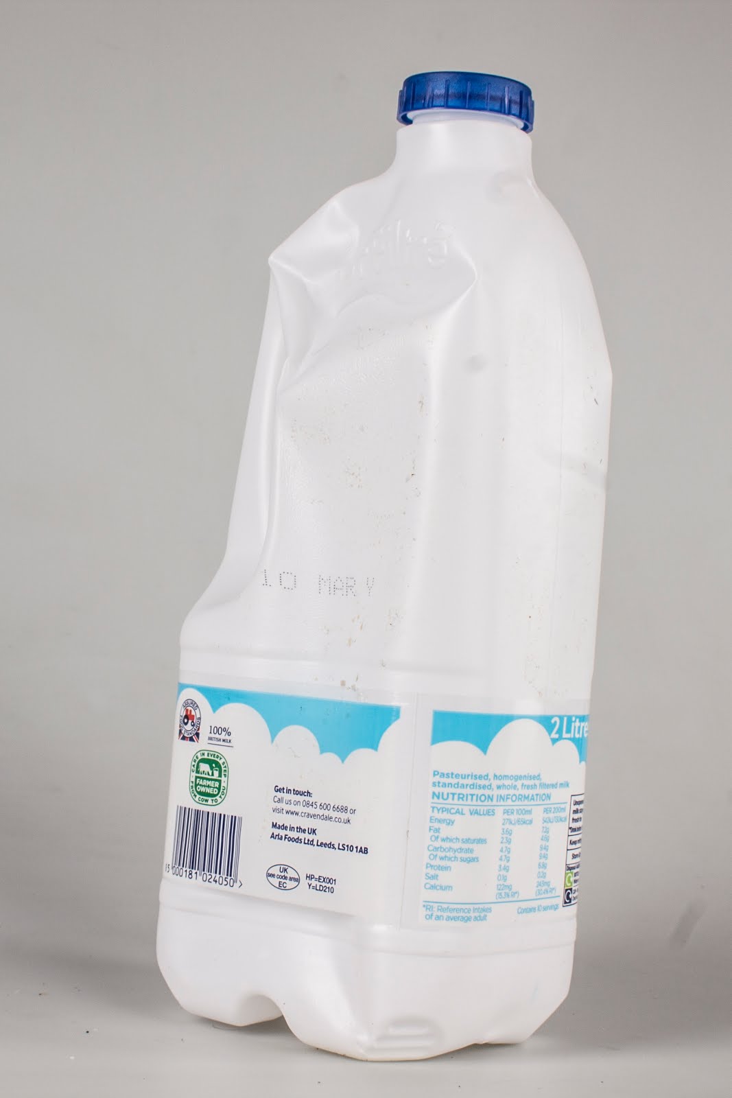
The images below show the photographs I have taken for this project. I must go through these images to find the best and most appropriate for my book. Once I have done this I will insert them into my InDesign document ready for print.



My final layout with photos can be seen below. I believe I have successfully completed this brief as works well to attract and inform my audience about my intended subject. The publication flows from page to page and keeps the reader interested throughout. I felt this was important from the start of the project especially as I was tackling what is usually seen as a boring subject.


I added some elements that I felt were important but hadn't been included previously. One thing I added were page numbers as I had forgotten these in my first layout. I first experimented with using Narziss Pro at pt size 18. This is my chosen headings typeface but due to thin parts of some letterforms, was unsure at first whether the type would be legible at the smaller scale, however found it still stood out and worked in correspondence to the rest of my layout.


I added some elements that I felt were important but hadn't been included previously. One thing I added were page numbers as I had forgotten these in my first layout. I first experimented with using Narziss Pro at pt size 18. This is my chosen headings typeface but due to thin parts of some letterforms, was unsure at first whether the type would be legible at the smaller scale, however found it still stood out and worked in correspondence to the rest of my layout.


Another thing I decided to include within my publication is a contents page. I feel this is necessary for this layout to help guide my audience through my book. I feel like the one I have created is successful in my layout and will be used within my final.
My next step will be to print my book. I will use the carefully selected stocks that I have collected. The photos from these results will be shown below.


I have decided to ask a number of other designers some questions to help me complete this project. This was show me how successful my publication has been and how well it would work within the real world.
My final piece of feedback came at the end of my project when I decided to ask some other graphic design students some questions about my final publication that I thought would better help me understand what I could have done better and what went well.
Do you think my publication is successful in creating interest in a subject which is usually considered as being boring? In summary, the designers I asked felt my final publication is very engagine. They feel the red line help ‘glide your eyes across the page’. One responce also notes how my content is interesting and how they ‘have never thought about these products in this way’. Although the aesthetics are most important, the content will help the reader continue through the book.
Is there anything you would change to help this become more appropriate for the brief or more successful as a design? One responce suggested I printed a full page in the red colour so the white type would be visible as the black isn’t consistant with the rest of the book. Although this seems like a viable option, the quality of the printer would have to be much better than the printer I used for this project. Due to the lower quality, ink will streak leaving marks in blocks of colour. This would not be as professional for my final design and so in this sense the black ink works better.
As a student do you think you would pick this up if it was free? if so why is this? The designers I asked agreed the interesting design and eyecatching colour of my front cover would attract my target audience into picking it up. They also liked the minimal design of my publication as felt it was suitable for my target audience. This is due to the popular clean, modern designs that are often picked up by design students.


