I decided to screen print my poster as this is a process that could be used if the posters were actually made for the event. This process is also appropriate because I used only two colour within my poster making the screen print quick and easy to produce.
As I have broken my hand I knew this process may be difficult however I have experienced doing it so wasn't too difficult with the help of the print room assistant. With my injury I found it difficult to pull and flush ink on to the paper so I was left with prints that had inconsistencies within the large blocks of orange colour.
The top black layer was easier to print as I didn't have to put as much pressure on such a large area of the squeegee. I had produced a large quantity of prints after my first layer as I tried to get all the ink to fill in the block colour, this meant I had room to experiment with the position of the paper beneath the screen. After several attempts I produced a print that I was happy with and could be used as my final outcome within the exhibition.
Wednesday, 17 May 2017

OUGD505 - Studio Brief 02 - Evaluation
This studio brief asked me to create an outcome based on an issue I felt needed to be addressed. I wanted to make sure I had a range of ideas throughout different aspects of the brief. I was able to do this by carefully exploring each subject during the research stage of my brief. Once I had established my focus on the treatment of animals within zoos I researched various areas including the guerrilla marketing techniques of companies and charities, how other designers have responded to this issue and other modern and eye catching poster design.
The research I did lead me on to the design of my poster which I again had a number of ideas which I developed within my design process. These were explored further after informative feedback helping me to produce the experimentation I did on illustrator. These critique's I took part in were important for the production of my final outcomes as helped me pick up on things I may have missed or could improve on. The final critique was most important as gave me a better understanding of how my intended target audience would react to my campaign.
Collaboration was an important part of this brief as I was unable to illustrate myself. I feel my organisation within this brief enabled me find an appropriate illustrator with ease as I did not have to rush the end of my project despite the time this process took. As I had already established what illustrations I needed and how they would best work within my final designs, working with Nenah was an easy process as we were able to comfortably communicate with each other and produce the final outcomes. This is something that I am glad I have done within Studio Brief 02 as finding and collaborating with professionals in this way is something I will be doing in the future. As working with Nenah on this brief was successful, I may also get in contact with her if I am in need of an illustrator in later projects.
My last critique showed me the success of my final outcomes which I was at first unsure of because of how much they had changed from my original sketches. I used pastel colours across the poster series which is a colour scheme I am unfamiliar working with but felt it was appropriate for my campaign. Its consistency throughout the final outcomes made the series more recognisable and brought the project together into a more complete campaign.
The research I did lead me on to the design of my poster which I again had a number of ideas which I developed within my design process. These were explored further after informative feedback helping me to produce the experimentation I did on illustrator. These critique's I took part in were important for the production of my final outcomes as helped me pick up on things I may have missed or could improve on. The final critique was most important as gave me a better understanding of how my intended target audience would react to my campaign.
Collaboration was an important part of this brief as I was unable to illustrate myself. I feel my organisation within this brief enabled me find an appropriate illustrator with ease as I did not have to rush the end of my project despite the time this process took. As I had already established what illustrations I needed and how they would best work within my final designs, working with Nenah was an easy process as we were able to comfortably communicate with each other and produce the final outcomes. This is something that I am glad I have done within Studio Brief 02 as finding and collaborating with professionals in this way is something I will be doing in the future. As working with Nenah on this brief was successful, I may also get in contact with her if I am in need of an illustrator in later projects.
My last critique showed me the success of my final outcomes which I was at first unsure of because of how much they had changed from my original sketches. I used pastel colours across the poster series which is a colour scheme I am unfamiliar working with but felt it was appropriate for my campaign. Its consistency throughout the final outcomes made the series more recognisable and brought the project together into a more complete campaign.
OUGD505 - Studio Brief 02 - Final Critique
Unfortunately I was unable to attend the final critique because of a hospital appointment for my hand. Because of this, I decided to ask some peers for feedback on my final designs. This included questions specific to my designs.
1. Do you think my final campaign is appropriate for the intended target audience? The use of pastel colours and the san serif typeface chosen was found to work well for these posters. My peers felt the audience would start reading the poster only to find out about my campaign so was effective.
2. Do you think my guerrilla marketing style of distribution is appropriate for my issue? My peers felt that using stickers as well as the posters within my campaign worked well to spread the issue. Posters
3. Do you think there is anyway I could have improved my campaign? The majority of people I asked felt I could have been more experimental with guerrilla marketing. Suggestions included being able to tear stickers from the posters or making the outcome so it interacts with my audience
4. Any other feedback? Everyone I asked feedback from seemed to like my response to the brief and felt it worked well to grab the audiences attention and inform them about the issue. One peer noted that an informative editorial may have been appropriate to work alongside the campaign and better inform the audience about animal welfare in zoos. This question's responses were informative and could have helped develop my project further if I had more time.
1. Do you think my final campaign is appropriate for the intended target audience? The use of pastel colours and the san serif typeface chosen was found to work well for these posters. My peers felt the audience would start reading the poster only to find out about my campaign so was effective.
2. Do you think my guerrilla marketing style of distribution is appropriate for my issue? My peers felt that using stickers as well as the posters within my campaign worked well to spread the issue. Posters
3. Do you think there is anyway I could have improved my campaign? The majority of people I asked felt I could have been more experimental with guerrilla marketing. Suggestions included being able to tear stickers from the posters or making the outcome so it interacts with my audience
4. Any other feedback? Everyone I asked feedback from seemed to like my response to the brief and felt it worked well to grab the audiences attention and inform them about the issue. One peer noted that an informative editorial may have been appropriate to work alongside the campaign and better inform the audience about animal welfare in zoos. This question's responses were informative and could have helped develop my project further if I had more time.
OUGD505 - Studio Brief 02 - Distribution and Final Mockups
I decided earlier in the brief that I would distribute my campaign using guerrilla marketing. I would want my posters to be tactically placed so they best influence my target audience. Because of this I would put in places with a large amount of tourists such as city centres. They would also be placed in the area around zoos where those visiting would see the campaign.
Stickers would be given to people out in tourist hotspots and outside of zoos. This gives people the opportunity to either keep the stickers for themselves or sick them around the zoo. As part of the campaign, these stickers could be purposely stuck around enclosures for best effect.
I also decided to mock up some t-shirts for volunteers to wear whilst giving out stickers and posters to the public. This was influenced by some of my original research and felt it could help influence people's opinion of zoos.


Stickers would be given to people out in tourist hotspots and outside of zoos. This gives people the opportunity to either keep the stickers for themselves or sick them around the zoo. As part of the campaign, these stickers could be purposely stuck around enclosures for best effect.
I also decided to mock up some t-shirts for volunteers to wear whilst giving out stickers and posters to the public. This was influenced by some of my original research and felt it could help influence people's opinion of zoos.


Tuesday, 16 May 2017
OUGD505 - Studio Brief 02 - Poster Production
After receiving the illustrations back from Neena I was able to develop my poster designs further to better suit the results. I also decided to place the illustrations and slogan onto stickers. This is something I had the idea of doing earlier in the brief as felt it would work well to incorporate within my campaign. These stickers could be given to my target audience as they enter/leave affected zoos giving them the opportunity to keep for themselves or to share the message with others as they're stuck in various public places. These developed designs can be seen below Neena's illustrations along with the stickers.


I edited some of Neena's designs in illustrator a little to better suit my ideas.


There were a few things I wanted to develop within my poster design. I first looked whether the illustrations would look better on a white background as they didn't stand out as much. This worked better as the illustrations were easier to see. I also felt the posters were too simple. I added a fold in the bottom right of the image and a + to show that it is an issue that is ongoing and has no sign of stopping.


There were a few things I wanted to develop within my poster design. I first looked whether the illustrations would look better on a white background as they didn't stand out as much. This worked better as the illustrations were easier to see. I also felt the posters were too simple. I added a fold in the bottom right of the image and a + to show that it is an issue that is ongoing and has no sign of stopping.


I pushed ideas further on my design adding lines across the poster to show how the animals are trapped. The designs below are my final developed posters.

OUGD505 - Studio Brief 02 - Poster Experimentation
My first step in my poster production after sketching my poster design ideas was to bring my ideas to illustrator. I first experimented with type and colour. I wanted to use a san serif typeface as felt this would be most appropriate for my younger audience. My experimentation using my chosen slogan can be seen below.

I wanted the colours of my poster to differ from other animal welfare posters looked at in research as felt the serious ideas they portray did not keep my intended audience interested in the issue. Because of this I looked at using bright and pastel colours.
I mocked up my poster sketches using the typeface I had chosen and different colour schemes I had looked at. Within these I felt a space for the illustration.


I have chosen to develop my poster idea for this brief. I have already experimented in my chosen illustrations in sketch form however, because of my broken hand (noted earlier in the brief) these aren't at the standard I would have hoped. Because of this, I have reached out to students on the illustration course at Leeds College of Art to see if anyone would be interested in collaborating on my final outcome. Within an hour I got a response from . After looking through her work, I felt she would be appropriate for my project as she often works in line drawings and has examples of animals within her work.


I mocked up my poster sketches using the typeface I had chosen and different colour schemes I had looked at. Within these I felt a space for the illustration.


I have chosen to develop my poster idea for this brief. I have already experimented in my chosen illustrations in sketch form however, because of my broken hand (noted earlier in the brief) these aren't at the standard I would have hoped. Because of this, I have reached out to students on the illustration course at Leeds College of Art to see if anyone would be interested in collaborating on my final outcome. Within an hour I got a response from . After looking through her work, I felt she would be appropriate for my project as she often works in line drawings and has examples of animals within her work.

OUGD505 - Studio Brief 02 - Poster Research
I decided to look into posters appropriate for my brief. Through sketch form I had a number of ideas of how I my posters would be designed however I felt my final outcomes could be improved with more research in this area.
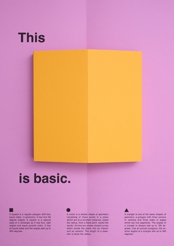
I first looked at more minimally design posters as they are more likely to catch my audiences eye. I also looked for posters that used bright colour effectively as feel it will also be more attractive to my audience.


I first looked at more minimally design posters as they are more likely to catch my audiences eye. I also looked for posters that used bright colour effectively as feel it will also be more attractive to my audience.


Subscribe to:
Posts (Atom)