Wednesday 30 November 2016

OUGD504 - Wireframes

Although previous critique feedback has pushed me towards my Monotype app idea, wireframes for at least 2 ideas are to be brought to my next critique so I have decided to develop the WhatThefont ideas further.


I sketched a number of different home screen options (seen above). Each focuses on the ease of use for the user. A simple slide up/down on the first idea and left/right on the second means the user can access the camera and camera roll straight after opening the app meaning fonts can be checked in seconds. These would be clearly separated using different colours making them easily distinguishable.

I created a number of options for a navigation bar which helps the user move around the app with ease (below). The option of the left drops down from the top left of the screen and is easily hidden so users can see more of the screen. The example on the right drops down from the top of the screen and is very similar to example of navigation bars within research. 

The interfaces below were created for users to select photos already on their camera roll. The simple layout in clean and easy to use making selecting photos a quick process.  


When an image is selected it can be cropped to help the app find the correct letterforms. The simple layout to do this can be seen below. Limited icons and large amounts of white space helps the user easily move through each stage of the font finding process.


When a user decides to capture type straight out of the app, the image will be scanned so each letterform can be detected. The previous interface for this on the What the Font app is dated and difficult to fill out. My new design focuses on each letterform per screen making it easier to understand.


The final stage in this apps design gives the user a number of options for which typeface it could be as the app is often inaccurate. I wanted this to stay simple but let the user easily look at the type in use.


_____________________________________________________________________________

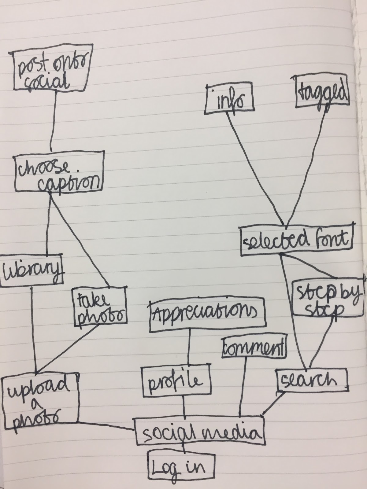
As I wanted to develop the Monotype app more than the first idea, my wireframes were more detailed and I went into depth within my notes.


Monday 28 November 2016

OUGD504 - Site Map

Site maps are a useful stage in the progression of a digital design. They can help show the designer and developer how the interface will work interactively. My sketches will also help in the production of my wireframes so are an important part of the design process.


Saturday 26 November 2016

OUGD504 - placement of elements within an app

After extensive research on apps and mobile interfaces, I noticed that interactive elements were often placed at the bottom of the screen to minimise how far the finger needs to travel to touch it. Despite this, I noticed that important information and icons within apps (such as the home button on Facebook and Instagram) are often placed at the top of the screen making them easier to view for the user. These are things I must consider whilst designing my own app.


The size of icons/buttons within an app must also be considered. Icons must be big enough to see and touch yet should not overcrowd the interface. When including these interactive elements within my design I will look at the sizes other apps and competitors use for inspiration.

Friday 25 November 2016

OUGD503 - Penguin - Developed ideas

Feedback from my critique told me to focus on my shoe print idea however I must continue developing this concept through sketches. I first looked at illustrating the image I found by hand.


I then decided to try digitally manipulate the image in a number of ways to see what I could produce.


I decided to ask a number of my peers on their opinions on my designs, noting the half tone designs looked a little . They proposed that I experiment with the position of the shoes print extensively, looking at how type can be placed in conjunction to image and how this can effect how the cover is portrayed. This will be done using sketches however my favourite designs will be brought to screen for further experimentation.

I must now look at how I can include the mandatory typographical elements such as the title, authors name and blurb (etc) on the front, back and spine. This should be informed by my research on other book covers and the brief requirements.

OUGD504 - Time plan

It is good to get into a habit where time plans are common place within briefs. They can prevent rushing, not being able to finish work and can help when juggling more than one brief at once. As OUGD504 runs alongside other briefs such as responsive and COP, I feel it is important that I keep to my schedule so I don't lose track of the work I am doing.

As I have not properly started the design aspect of my brief, I have decided to list what I have left to do on the brief in the time I have as this will help me more than a detailed time plan which I may not stick to.

Wireframes

Mock ups

Developed ideas

Elements within the app such as icons and added features Creating my app on XD

Final video

Evaluation


Thursday 24 November 2016

OUGD504 - Icon Research

I researched into how icons have been used in existing apps. Looking closely at what worked well and could be applied to my own work as well as what was less successful and should be avoided. I looked first at social media apps as there would be similar features to what may be seen within my Monotype app.

Instagram


The icons that Instagram use are simple and reflective of its layout. They are easily recognisable yet unique to the app and will therefor inspire my own icons.

The bottom bar of icons stays the same throughout the app meaning the user can navigate to any page at any time. This is a useful feature to include within any digital interface and is something I should consider using within my own app.

Facebook


Facebook has a more complicated layout to Instagram because of its extended features however icons remain simple. There are more unique examples that don't appear on other apps however their purpose is still obvious making it easy to navigate through the app. Recognisable icons such as the hamburger (seen below) are also used recurrently, this is used to show a drop down menu (above right) where further pages within the app are made accessible.

OUGD503 - Penguin - Critique

I explained my ideas to a group of peers who would help me choose which I should progress with. I noted that I wanted an ambiguous cover that was still shocking as the brief had asked. The crit group gave me feedback on each idea, noting things that could be improved to better suit the brief and target audience.

1: Killers car
-less obvious design however there is a clear link to the story.
-a dark, illustrative design would be appropriate. could highlight the shadows?
-hand drawn tpe would fit well with an illustration.

2: Shoe Print
-ambiguous.
-successful link to book and real life events.
-could be experimented with using different illustrative styles (digital and by hand).

-look at the placement of the footprint on the page and what would be most effective.

3: Toy
-May come across as inappropriate on display in a book shop.
-would work well as a photographic response however I must consider the background.
-more expensive than some of my other ideas as must source the toys.
-very ambiguous, doesn't link as well as some of the other ideas.

4: Family Home
-more obvious than the other ideas.
-if I continue with this concept, I should look at experimenting with a range of media.
-an illustrative design maybe an obvious response to this idea.

5: Typographic Response
-already a number of typographic designs for the cover 
-not ambiguous and hard to be as shocking
-maybe worth experimenting as I can incorporate within my other ideas

My crit group felt the two ideas that would be most successful in conjunction to the brief are the family home and shoe print because of their ambiguous nature as a design yet clear link to the original story. My next step in the design process will be to experiment with my two ideas through sketches and later onto digital illustrations.

OUGD504 - Monotype

Monotype
Founded in 1987, this digital typesetting and typeface design company has an extensive library of typefaces. Monotype's buying of companies such as Font Shop and the International Typeface Corporation has gained them access to Helvetica, FF Din, Optima and many more.

Although starting up as an original may to print type using their Monotype Machine, it has grown into a company with a large online presence. Today, monotype has a number of digital outlets such as My Fonts, the online type retailer that sells the fonts of many independent type design studios. This is the platform that also has the What the font service that I have looked at previously within this project.

An mobile app is also available from Monotype however it is difficult to use and and its purpose is to...


One exceptional interface by Monotype is their website which is clean and easy to use. Their broad library of fonts is easily explored, the company is explained clearly and there are interesting and interactive elements that keep the audience from leaving the site.


If I am to create an app for Monotype as suggested previously within my brief, I must use some elements of the design already used by the company. This includes the logo, colour scheme and most importantly for this brief, the typefaces they use.

The logo is simple, easily recognisable and uses a custom serif typeface. It is different to the other typefaces they use which are Malabar and Strada.

Monotype logo
The typefaces used


The colour scheme is also clean and simple using only black, white and light grey respectively. I must also use these colours within my own design.


Tuesday 22 November 2016

OUGD504 - Target Audience

It is very important that my target audience is considered throughout my design process. I understand that I am not designing for myself or the client but the user of my interface. As I have more of an understanding about my target audience (as users will most likely be designers) I can look more in depth at what features and aesthetics are most appropriate. Being a design student myself and constantly surrounded by this audience, I have the opportunity to find out directly what the user would want from my app. One way of doing this is to ask my peers a number of questions about how hey currently find typefaces and how my interface could enhance their experience.


How do you currently find the typefaces you use within your design work?
Websites such as Fonts In Use, Designspiration and Behance show designers examples of typography. The people I talk to often use these services for inspiration. They usually then search the fonts used to find if they can be downloaded.

Do you ever search for the typefaces you see day to day?
Feedback showed me that my peers often ignore the fonts they see and like unless they are unique or widely used as they can be difficult to identify. This is something I am looking to solve within my brief.

What service do you use to download fonts?
I found from the design students I talked to that they often use programs such as Google Font and Adobe Typekit to download their desired fonts as these service are clear, easy to use and often offer free alternatives to paid alternatives

Do you often share the typefaces you find with your friends and peers or keep them to yourself?
I found that the students I talked to do often share the typefaces they use. I noticed this is common within the studio where people often ask each other what is being used in each project.

Would you be interested in a service that helps you find new fonts, see how fonts have previously been used and help identify fonts you see but cannot name?

The people I asked for feedback felt this would be useful within their design process as would help expand their knowledge of existing fonts.

Monday 21 November 2016

OUGD504 - type foundry research

I decided  to also look at services where users can download fonts as they often have large libraries of fonts available and unique ways of viewing them. This may be useful later on in my brief and could influence some of my design work.

Google Fonts
This clean layout makes it easy to view each typeface. Boxes can be ticked on the right of the screen to find different examples and a search bar makes it easy to find fonts the user knows the name of. This service includes a wide range of fonts however as none of them are owned by google, many have external links to places to buy them which can be an issue for students who cannot afford this service.


Adobe Typekit
Similar to Google Fonts, this service allows user to search, view and learn about different typefaces whilst also having the opportunity to download them for free. Unlike Google Fonts however, Adobe's program only comes free on Creative Cloud, a service which most designers pay for. Because users must have an account to download these fonts, a wider range of examples are available. Having a subscription service such as this is a good way to get more out of the program and is something which should be considered for my own design ideas.


Monotype
Monotype is one of the first type collections and so they have a large library of fonts. Their clean website is easy to use and some unique fonts can be looked at in more detail. Although there is a subscription to use all fonts, each can also be bought separately. This is foundry suitable for professionals because of this however is also very accessible to students because of its good user experience.


There are also a number of apps which can be used to help find fonts by listing their extensive library. Two which I think work particularly well are Fontasy and Fonts.

Fontasy
Although Fonts available are limited, this app has a clear and has an effective layout which can be easily navigated. Each font can be viewed in each style and can be seen in using the users own text. as seen below.


Font
This app is very simple and lists only a small number of fonts unless it is upgraded. Despite this, the layout is very clean and easy to use. It also works well to show the font as body text and in various colours. It also has an option to download each font making it useful for designers.

OUGD503 - Penguin - first ideas

I took some preliminary ideas from research on the crime scene and the film however others were inspired more ambiguous book covers I found.

Idea 1: Killers car
An illustration or photograph of the car used by Hickcock and Smith to drive to the Clutters household and further on to Mexico.


-ambiguous response
-could suggest the escape to Mexico within the imagery
-blood stained tyre tracks could show how they fled the crime scene.

Idea 2: Shoe print
Being one of the only pieces of evidence left at the crime scene, this idea works well as a less obvious response because of its unusual markings.


-Illustrate or edit original photo to work best for my cover.
-could include the obvious blood red or move away from this.

Idea 3: Toy found in victims bedroom
This would be an ambiguous response as doesn't have a clear visual link to the book however it may be a way to shock the audience without using graphic imagery.


-teddy bear originally seen in one of the victim's bedrooms
-ripped up toy (signify victims being shot)
-maybe use 4 different bears?

Idea 4: Clutter family home
This home became iconic at the time after being seen on nationwide newspapers.


-maybe considered as an obvious design
-would work well as an illustration however some styles would be more appropriate than others.


Idea 5: Typographic response
I would use a typeface reflective of the time the book was based and position text to support the shocking ideas within the content.

Even if I don't continue with this type idea, I can use the experiments I make as inspiration for the type I must include on the design.


I will bring these ideas to a critique for further development and help me choose the most appropriate response to the brief.

Sunday 20 November 2016

OUGD504 - critique & idea generation

Feedback from my previous discussion on Tuesday called for the addition of more solutions to my problem as felt I was limiting myself by only redesigning the What the Font app. I explained my problem and my ideas so far to combat the brief. The feedback can be seen as follows:

How can a design conscious target audience find the typefaces they encounter during everyday life?


1.
Re-design the What the Font app by reinventing the dated design and adding features that weren't previously available on the app.

feedback
My group noted that this idea maybe too simple and obvious, they felt it would be good to expand on the ideas that have already been used in this app within my own brief as some are successful.


2.
Creating a social media for typefaces where users upload their photos or screen shots and can ask each their followers what font is used.

feedback
The group suggested that this would work well however should include another way for people to find a font incase the users followers can't provide the answer.


3. 
An app that help to find typefaces through searching characteristics and looking through an extensive library of examples to find the most appropriate font.

feedback
Although feedback was positive on this concept, they felt it was more of a research tool and would work well as a feature within one of my other app ideas rather than on its own. This is because of the impractical amount of time it may take to find the typeface the user is looking for.


Overall, from this feedback I have found that the best solution to the brief will be to combine aspects from each idea together as they all have feature that could work successfully. My next step will be to consider the problems the user faces on similar apps that are already available and look at how they could be improved. I will also look at successful design features which could influence my own work.

Saturday 19 November 2016

OUGD504 - coding

Coding and designing for screen

Languages:
HTML - hyper text markup language
CSS - cascading style sheets
Java - android
Javascript - advanced effects
SQL - database language
PHP - server based language
iOS - apple language
Ruby - twitter

Designing for browsers

Chrome
Firefox
Safari
etc

all use HTML and CSS

Devices

desktop computers
laptops
tablets
mobile phones
etc

RESPONSIVE WEBSITE
(works with different devices)

BREADCRUMBS
navigating from one page to any other page on the website

HAMBURGER ICON
drop down menu on phone (navigation menu)
-look at facebooks use of the icon

72px/inch before retina
(loads images quicker)
Retina screens almost always take longer to load as file sizes are often bigger.
The average user waits 2.6 seconds to decide whether they will stay on a website or move on.

Accessibility

screen readers read out the contents of screen to the user. Most common for those who are visually impaired.
Laws have been passed so they have to be accessible to anyone

Tags

open <home>
close </home>


Have to be included in all websites. They must all also close.

<html> </html>
<head> </head>
<title> </title>
<body> </body>

homepage is called index so can be understood around the world